Best 8 Fintech Website Design Examples (2026 Guide)

Let's Build Your Webflow Website!
Partner with experts who understand your vision. Let’s create a converting user experience and build your website for future growth.
Best Fintech Website Design Examples: Inspiration & Analysis (2026)
Fintech companies need to do two things well: move quickly and stay organized. However, in 2026, we can see a massive gap between the old-fashioned banks and the new financial tools. Unless you bridge that gap, you risk losing more than design points - you may lose user deposits and trust.
That’s why we prepared some of the best fintech website design examples. You can take them as an inspiration in case you want to refresh your web presence, or when you’re creating something new.
Quick Answer
Best fintech website design examples: Stripe sets the standard for developer-focused fintech with a clean design and exceptional documentation. Wise (TransferWise) excels at simplifying complex pricing. Revolut balances feature-rich banking with modern aesthetics. Mercury demonstrates B2B fintech excellence. Ramp shows how to make corporate finance feel modern. Key fintech design principles: build trust through transparency, simplify complexity with visuals, and balance innovation with credibility.
Abstract
Finance design is a high-stakes performance, and it is all about balance and control. You must be innovative and modern, but stable enough that users can trust you with their life savings. Your design must eliminate friction in money management and turn possible anxiety into confidence. This guide showcases some of the biggest fintech players on the market. We analysed why their design works and how they transform visitors into users.
As an Enterprise Webflow Partner, we've worked with financial services companies that need websites that project trust while driving conversions. We understand the balance fintech demands. Whether you are a founder, a marketer, or a product lead, these takeaways will help you build a site that looks as secure as it feels.
Quick-Reference: Top Fintech Website Examples
Core Fintech Design Principles
- Trust first: Use security badges, certifications, and transparent terms to prove you're legitimate.
- Simplify complexity: Use visual explanations and guided flows to demystify pricing.
- Modern but not trendy: Aim for a timeless look that feels innovative without being a fad.
- Mobile-first: Most people manage their money on a phone; your site must reflect that.
- Performance matters: Fast load times signal reliability. A slow site feels like a risky bank.
- Accessible: Financial services have to work for everyone, regardless of ability.
Key Features of the Best Fintech Website Designs
Flashy designs are all around us. However, fintech industries shouldn’t take this direction. Fintech brands push hard to present themselves as the most modern players in the market, but looks alone don’t carry the weight.
A sharp interface helps, yet it’s only part of what earns trust. It is about creating a digital space in which users feel safe enough to link their bank account. The first feature that we will be analysing is design, and it is what usually gives the user confidence within the first few seconds.
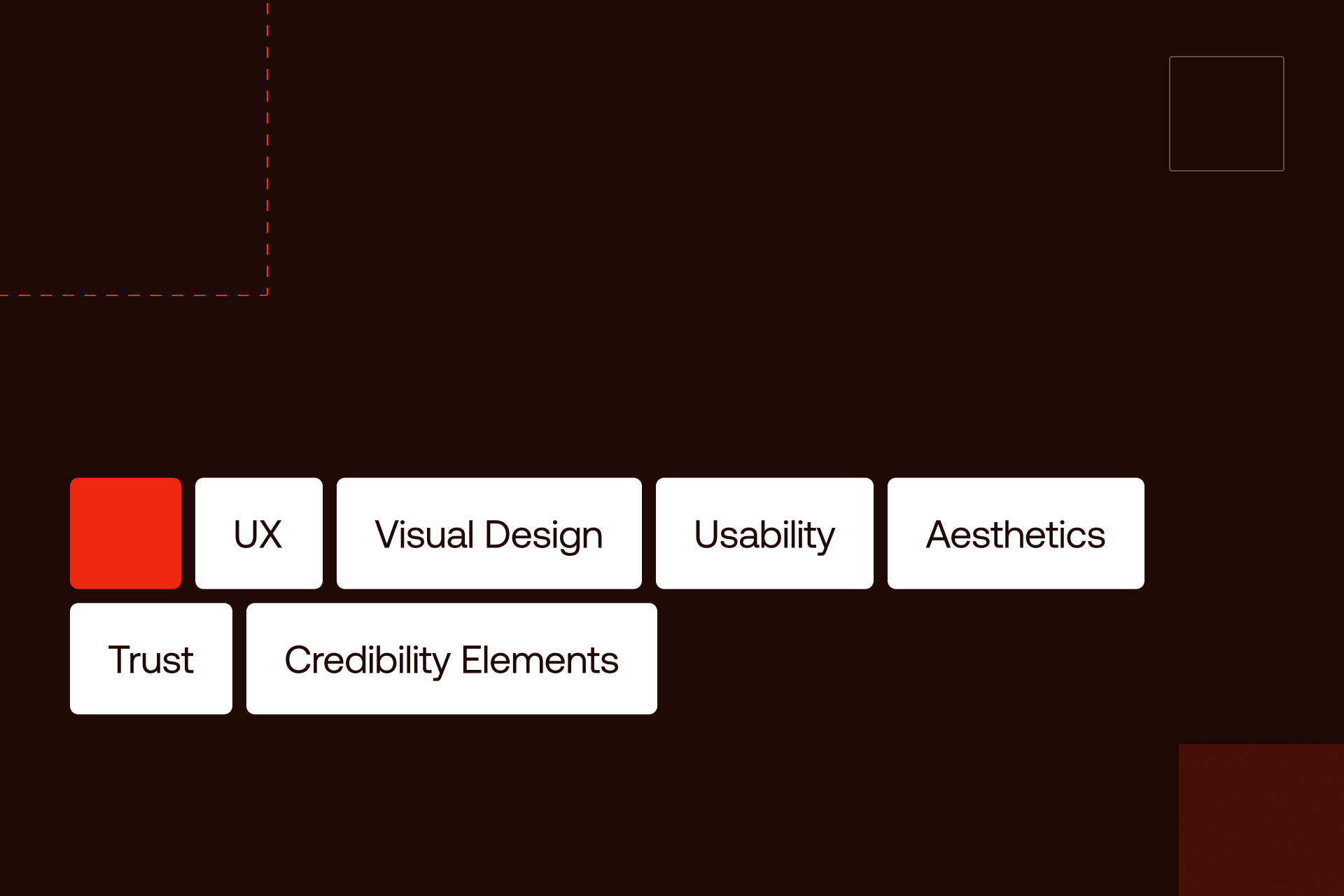
User Experience (UX) and Usability
For a fintech website, UX is equal to product. If a user can’t locate the login button or get what you offer in less than three seconds, you have failed.
The navigation should be clear enough that customers don’t need to dig through menus to find support or manage their account settings.
This is particularly important for mobile users.
A mobile-first approach is the key requirement since most financial decisions are made on the go. This implies touch-friendly buttons, responsive designs that do not crash on smaller screens, and fast load times.
Accessibility is the other half of the coin. Financial services are a utility, and this implies that they should be usable by all. This includes compliance with WCAG standards, high-contrast ratios, readable font sizes, and full compatibility with screen readers. We also focus on simplified user flows. Progress indicators and error-prevention methods (such as inline validation) help you alleviate the fear of completing complicated financial forms.
Fintech UX & Usability Patterns
Visual Design and Aesthetics
In 2026, clean interfaces prioritize function over form. That’s why we apply white space, as it provides the breathing room necessary to process dense financial data without feeling overwhelmed. Today, the "minimalist" look is the industry standard because it signals professional restraint.
Color psychology plays a massive role in how a brand is perceived before a single word is read. While traditional banks clung to blue for decades to signal stability, modern fintechs are branching out.
Typography also carries weight for fintech. Numbers must be easy to read. Tabular fonts are often used so that columns of figures line up perfectly.
Stripe uses a clean, developer-centric aesthetic, while Mercury leans into a sophisticated dark mode that feels more like a luxury brand than a bank.
Color Psychology Table
Trust and Credibility Elements
Trust is the most expensive thing a fintech brand can buy, and your website has to earn it instantly. This is done through a specific hierarchy of trust signals. Security badges (PCI, SOC 2) and regulatory information aren't just fine print - they are the foundation of your credibility. For B2B fintech, these certifications are often the first thing a CTO looks for.
Social proof is the next layer. This includes logo walls of well-known partners, customer testimonials, and "as seen in" press mentions. If you can show that 10 million people already trust you with their money, the 10,000,001st person feels much safer.
Finally, transparency is the ultimate trust-builder. Wise is the gold standard here; their real-time fee calculator shows you exactly what you’re paying and what your old bank is likely hiding from you. When you hide your terms or bury your fees in a PDF, users assume the worst.
This is part of what we handle through our Webflow development services.
Modern design brings that data to the surface:
- Wise: Uses real-time calculators to prove transparency.
- Mercury: Places FDIC insurance info prominently to negate "startup risk" fears.
- Lemonade: Uses a transparent claims process to humanize insurance.
Best Practices in Fintech Website Design Examples
The difference between a fintech site that converts and one that just sits online comes down to specific execution patterns.
The good news: you don’t have to start from scratch. You just have to choose wisely the design principles that will do the right job.
Homepage and Hero Section
Your hero section has about two seconds to answer three questions:
- What is it?
- Who is it for?
- Why should I care?
If we analyze some of the best fintech companies, we can see that Stripe, Mercury, and Wise don't waste words. They use a clear, one-sentence value proposition paired with a primary CTA and a visual that proves the product exists.
Different business models require different hero patterns. A B2B tool like Ramp focuses on the bottom-line benefit ("The corporate card that saves you money"), while a consumer-facing app like Wise leads with a functional tool, their currency converter. This "show, don't tell" approach builds immediate technical credibility.
Even if it may be the easiest solution, it’s not recommended to use generic stock photos. Especially the ones with people smiling at their phones. In 2026, users want to see the interface of your product. If your UI is clean, show it off. If not, fix the product before you fix the website.
Homepage and Hero Best Practices
Landing Pages and Conversion Optimization
A high-converting fintech landing page follows a predictable, psychological arc:
Hero (Hook) - Problem/Solution (Value) - Features (Evidence) - Social Proof (Trust) - FAQ (Objection Handling) - Final CTA.
The CTA itself needs to be high-contrast and action-oriented. "Submit" is a technical term; "Start now" or "Open an account" are human actions. We've seen that placing trust signals like an FDIC logo or a "Join 10M+ users" tag right next to the signup button significantly reduces "click fear."
Visuals should do the heavy lifting for complex concepts. Don't write three paragraphs on how your API works; instead, use a custom illustration or a clean code snippet. This is where Stripe wins every time they make technical infrastructure look like art.
Fintech Landing Page Patterns
Mobile-First and Responsive Design
For fintech and most users, mobile is the primary screen. If your mobile site feels like a condensed version of your desktop site, you are losing users.
Excellent mobile design uses app-like patterns: sticky bottom CTAs for easy thumb access, hamburger menus that don't overlap with vital info, and single-column forms that are easy to tap through.
Performance is the silent killer of trust. A site that takes five seconds to load on a 5G connection feels broken. We aim for sub-three-second load times by prioritizing image optimization and lazy loading.
- Navigation: Move from horizontal desktop headers to bottom-nav or clean hamburger menus on mobile.
- Tables: Don't shrink a 10-column table; transform it into a series of swipeable cards.
- CTAs: Use sticky buttons at the bottom of the screen so the "Sign Up" option is always a thumb-press away.
Revolut and Chime provide the best examples here; their mobile web experiences are so fluid that they almost feel like native apps, which bridges the gap for users who aren't ready to download the full app yet.
To see more examples, check how we applied similar patterns in our enterprise work.
Inspiring Fintech Website Design Examples
Looking at a UI kit is one thing, but seeing how these industry leaders solve real conversion problems is another. This isn’t about a big budget. It’s about how they have a deep understanding of their specific users' psychology.
Case Studies of Top Fintech Websites
Here are some of the strongest examples of fintech website design that show what works.
Stripe (stripe.com)
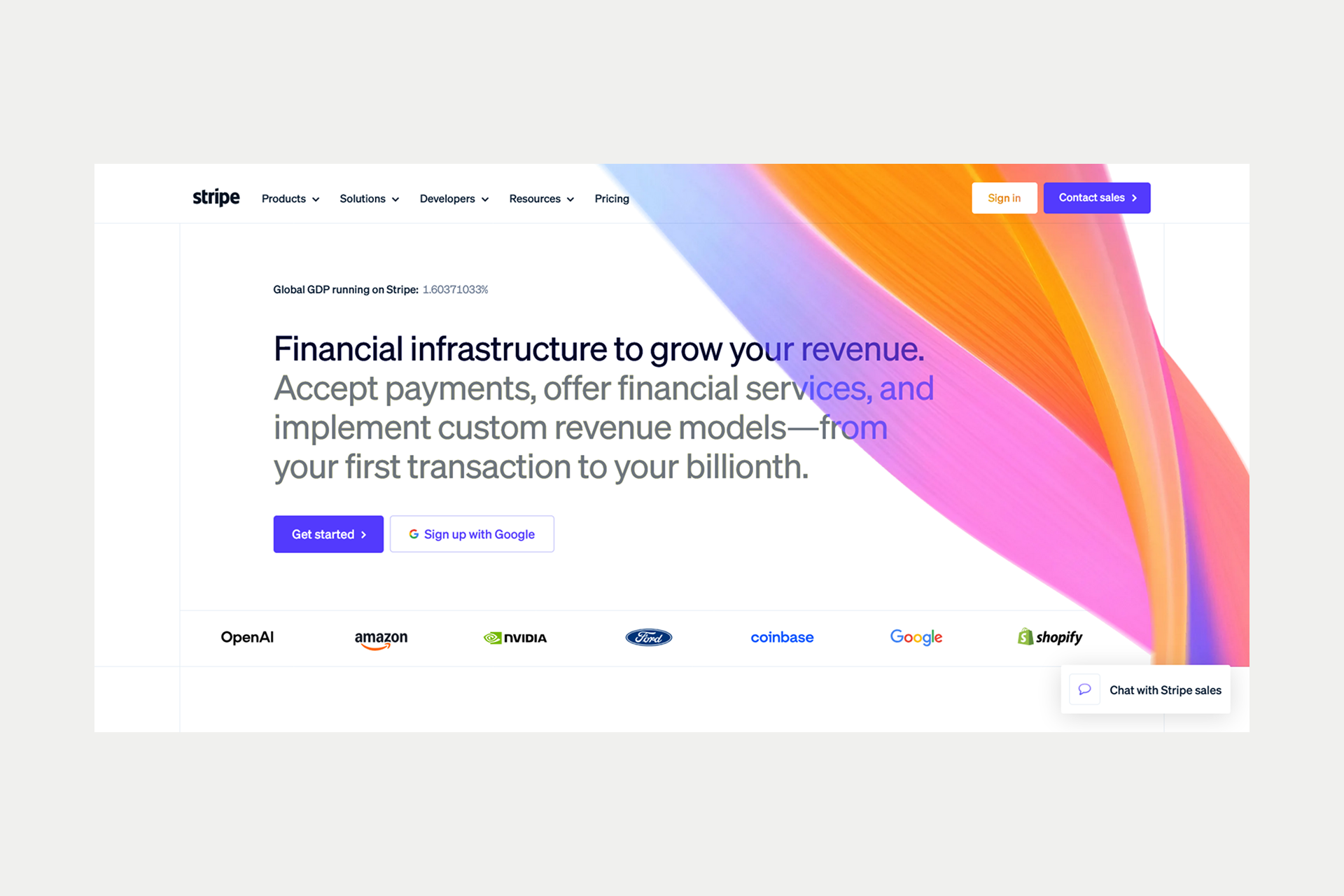
Stripe is the undisputed heavyweight of developer-focused design. Their "Payments infrastructure for the internet" headline is backed by a technical, clean aesthetic that prioritizes code snippets and documentation. They famously use blurred gradients and rhythmic animations to make invisible product API calls feel tangible and high-end.
Key takeaway: If your audience is technical, your design needs to scream "technical credibility."
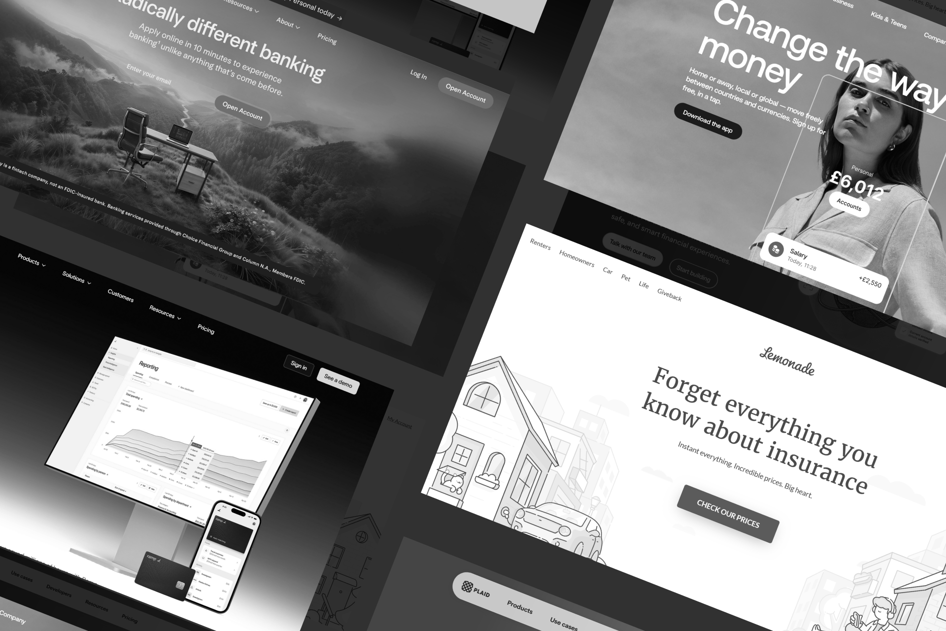
Wise (wise.com)
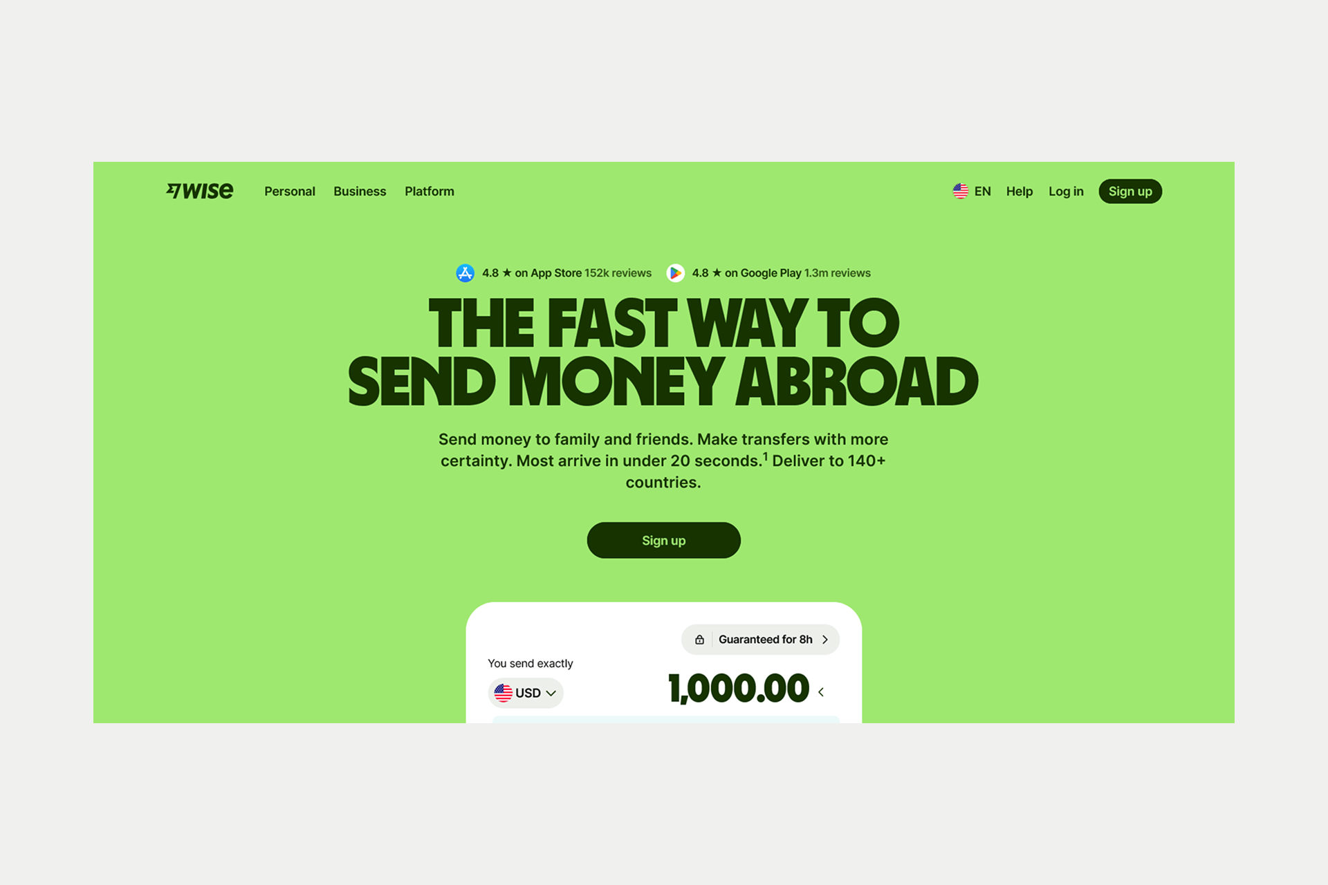
Wise (formerly TransferWise) has built an entire brand on being the "anti-bank." Their design reflects this through radical transparency. The centerpiece of their homepage is a real-time fee calculator that compares their rates against traditional banks. It’s friendly, approachable, and uses high-contrast typography to ensure there are no hidden surprises.
Key takeaway: Transparency isn't just a policy; it’s a core design feature.
Mercury (mercury.com)
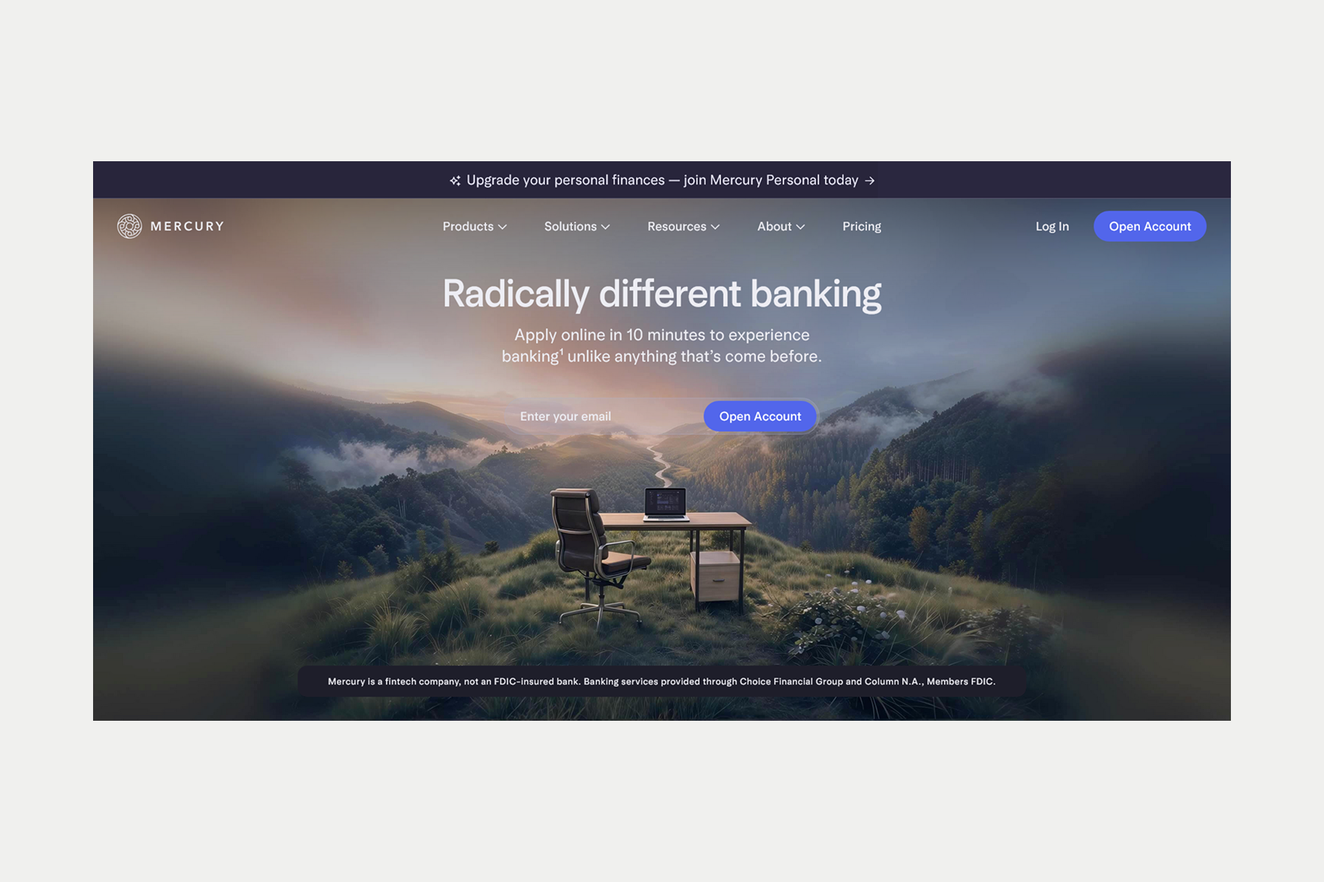
Mercury redefined what B2B banking looks like. By leaning into a sophisticated dark mode and high-fidelity product screenshots, they positioned themselves as the bank for the "aesthetic" startup founder. Their information hierarchy is incredibly flat, meaning you are never more than two clicks away from understanding their core features.
Key takeaway: B2B fintech doesn't have to be boring; it can be a lifestyle brand.
Ramp (ramp.com)
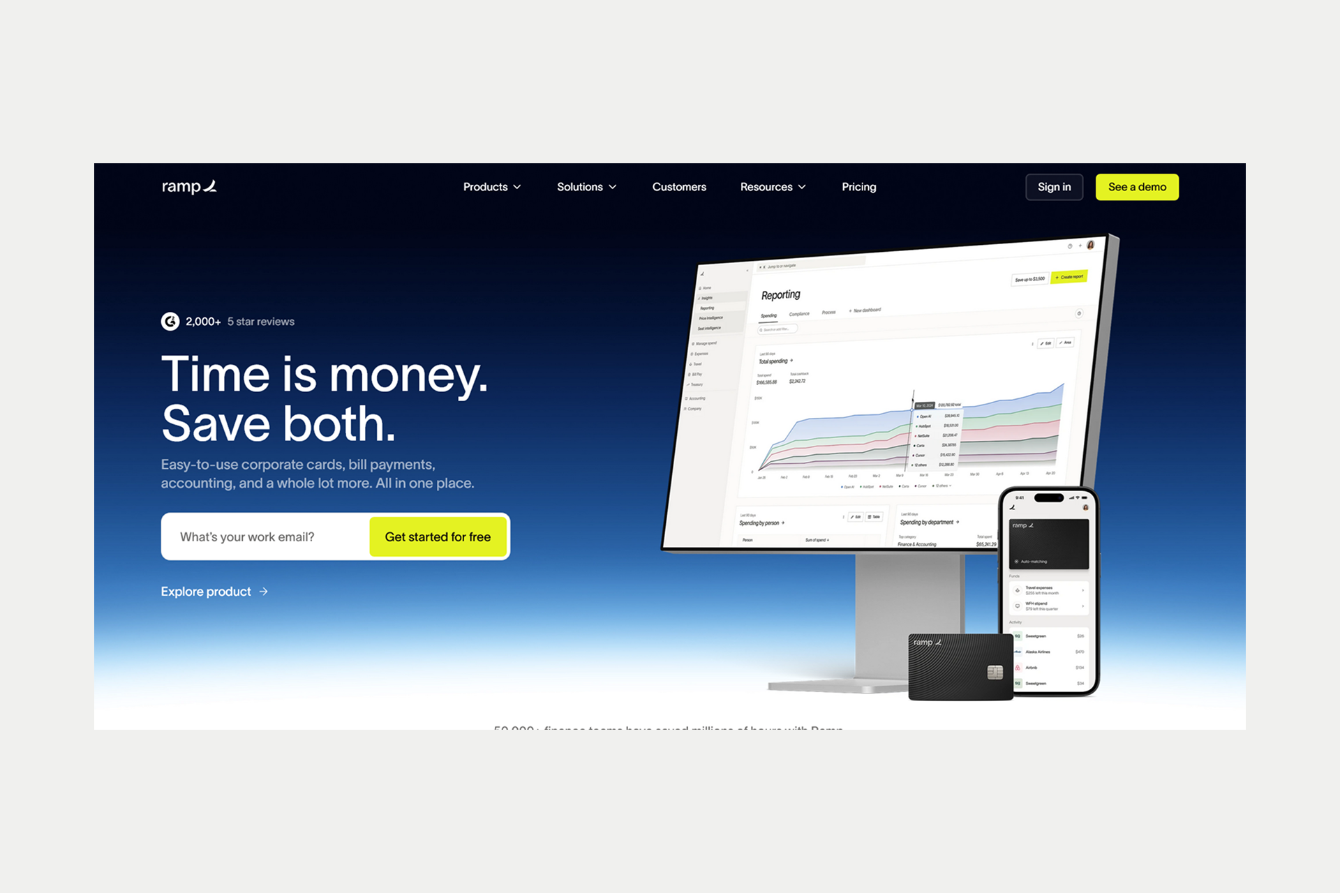
Ramp focuses on the bottom line: saving money. Their design is data-driven, featuring savings calculators and clear, benefit-led copy. They use a clean product UI to show exactly how their spend management platform works, removing the mystery from corporate finance.
Key takeaway: Lead with the value proposition and prove it with hard data.
Revolut (revolut.com)
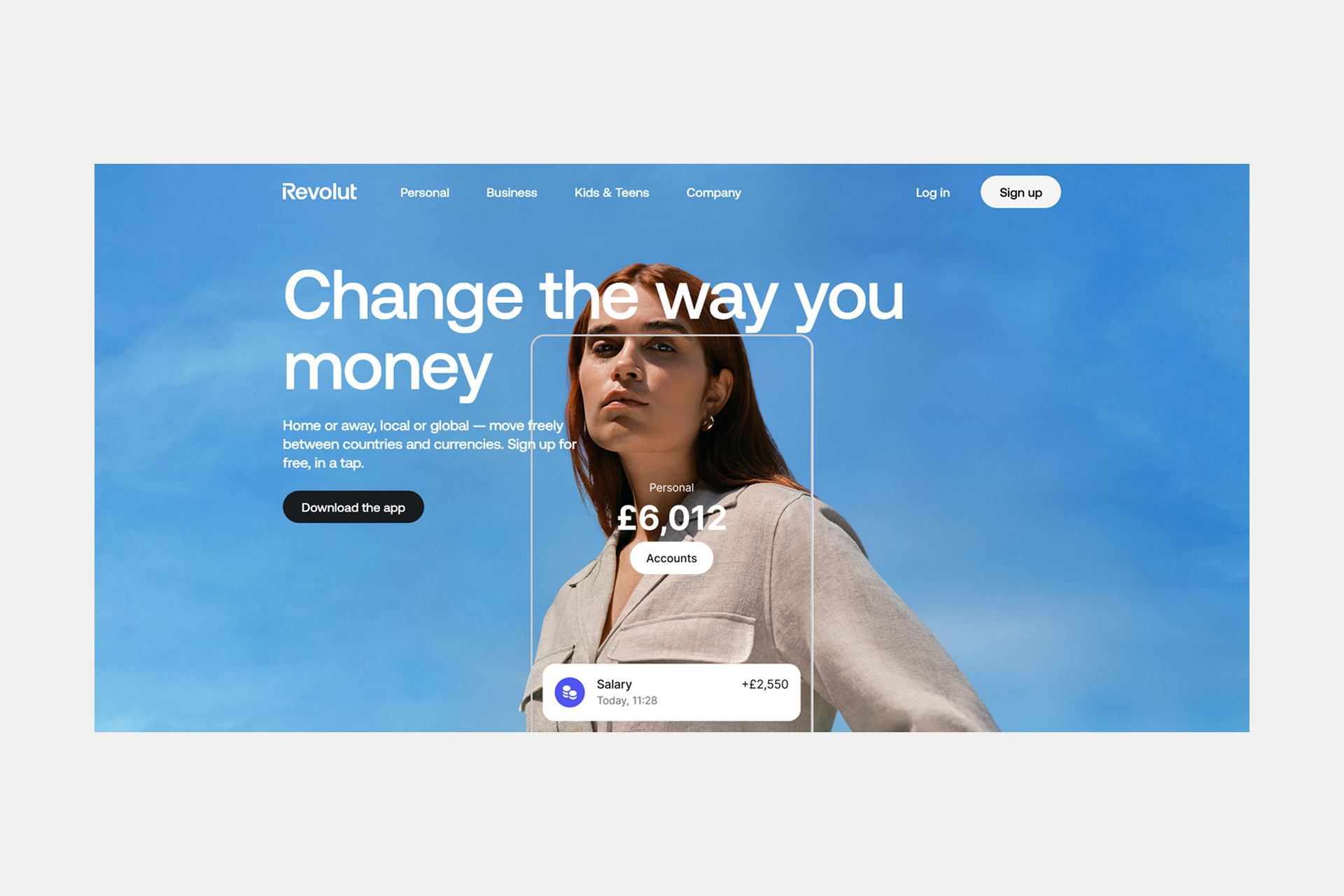
Revolut manages to cram dozens of features from crypto trading to pet insurance into a single interface without it feeling like an overloaded interface. They achieve this through an "app-like" web experience, using bold headers and a very organized navigation system that categorizes products by user intent.
Key takeaway: Many features can still feel simple.
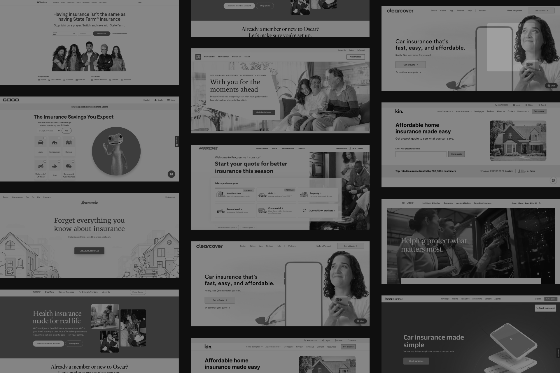
Lemonade (lemonade.com)

In the sterile world of insurance, Lemonade uses a vibrant pink palette and a conversational, chatbot-driven interface to stand out. They’ve replaced 20-page forms with a friendly dialogue, making the often unpleasant task of buying insurance feel modern and painless.
Key takeaway: Personality differentiates in boring categories.
Plaid (plaid.com)
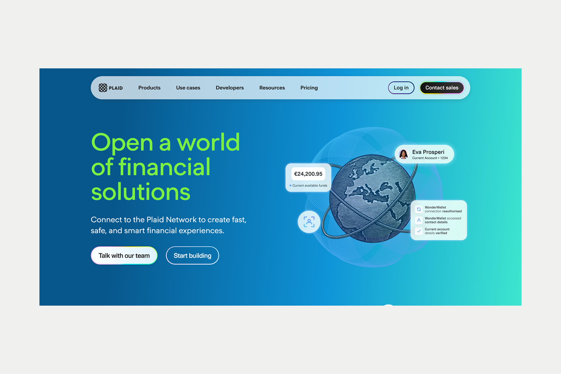
Plaid sits in the middle of the ecosystem, connecting apps to banks. Their design balances technical depth for developers with "enterprise-ready" messaging for business executives. They use clear diagrams to explain complex data flows, ensuring both audiences feel understood.
Key takeaway: B2B fintech needs to balance technical and business audiences.
Emerging Design Trends in Fintech Websites
In 2026, we’re seeing how fintech websites are moving away from the "standard" SaaS look toward more immersive experiences. Dark mode is a default setting for brands like Mercury and Stripe that want to signal a premium, sophisticated feel. It also happens to reduce eye strain, which is very user-friendly for people spending all day at financial dashboards.
Microinteractions and scroll-triggered animations are being used to guide a user’s eye toward key data points. For example, as you scroll past a savings chart, the line might animate upward, subconsciously reinforcing the benefit of the product.
These features are simple to support through Webflow integrations.
Here is a summary of the core fintech-specific trends for 2026:
Balancing Functionality and Aesthetics
The ultimate challenge in fintech is the "feature vs. friction" battle. You want to show you have a robust product, but you don't want to overwhelm the user. The solution is Progressive Disclosure: showing the user exactly what they need at that moment and nothing more.
Balancing functionality and aesthetics for fintech means:
- Performance is the other half of this balance
- A "beautiful" site that takes four seconds to load will lose users
- In finance, speed equals security
- If your site is slow, a user will assume your transaction processing is slow, too
We optimize this by using CDNs, lazy-loading heavy assets, and keeping our code lean.
Building Your Fintech Website
Creating a high-performing fintech website is far more than picking a nice color palette. It’s about building a digital experience that satisfies both the user's need for simplicity and a compliance department's need for rigor.
Design Principles for Fintech Success
The most successful fintech sites operate on a "Trust-First" methodology. If the design feels unstable or overly experimental, users will hesitate to provide their sensitive financial data. Every pixel should work toward proving your legitimacy.
Avoid the common trap of using generic stock photography of people shaking hands. In the modern fintech era, these images feel dated and insincere. Instead, use high-fidelity screenshots of your product in action. This shows exactly what the user is signing up for and builds immediate confidence in your technical capability.
Next Steps: Building Your Fintech Website
Choosing the right technology stack is as important as the design itself. We recommend Webflow for fintech marketing sites. It offers the perfect balance of designer flexibility and enterprise-grade hosting. More importantly, it allows for rapid updates critical for an industry where regulatory requirements or feature sets change overnight.
Building in this space requires a partner who understands more than just "pretty" design. You need an expert who understands the nuances of financial compliance, trust-building UI patterns, and high-stakes conversion optimization.
Let’s Discuss Your Project!
Shadow Digital is an Enterprise Webflow Partner with a deep track record in the financial services sector. We specialize in creating websites that project the stability of a legacy bank with the innovation of a Silicon Valley startup. We understand the unique pressure of balancing brand expression with regulatory demands.
Building a fintech website that balances trust, innovation, and conversion requires expertise. Shadow Digital specializes in enterprise Webflow websites for financial services companies.
Contact us.
FAQ
What makes a good fintech website design?
A good fintech site balances high-end looks with clarity. It needs to look modern enough to be innovative but stable enough to trust with money. The best designs prioritize a simple user experience where the interface stays out of the way. This means using flat menus, fast load times, and a clear hierarchy. You are selling a sense of security. If a user feels confused by the layout, they will lose trust and leave for a more professional competitor.
How do fintech websites build trust?
Trust comes from transparency and visible security signals. Practically, this means putting regulatory info, FDIC logos, and SOC 2 icons in clear areas like the footer. Beyond badges, use actual product screenshots rather than stock photos. Tools like fee calculators or "no hidden fee" messaging also help. When a company shows how it works and how it protects funds, the risk for the user feels much lower.
What are the most important elements of the design?
The core parts are a strong value proposition, simple navigation, and social proof. Your main header must explain what you do in seconds. You also need a layer of security credentials and partner logos. Functional tools like calculators or easy sign-up flows are vital for conversion. Performance is also key; a slow site suggests a lack of technical skill, which is a red flag in finance.
What colors work best?
Color choice depends on your specific brand. Blue is the standard because it feels stable and like traditional banking. Many modern firms use green for growth. For premium B2B services, dark modes with black or charcoal suggest a high-end feel. More disruptive brands use vibrant colors to stand out from the status quo. Consistency is the main goal; your palette should back up your position in the market.
Should fintech sites use dark mode?
Dark mode is common for brands like Mercury and Stripe. It offers a professional feel that appeals to tech-savvy founders. It also reduces eye strain for users spending hours on dashboards. It shouldn’t be the only option, though. The best approach is to offer a toggle or ensure your colors work in both light and dark settings. If you want to look modern, dark mode is a strong tool for that high-end feel.
How important is mobile design?
Mobile is the primary way users check their finances. A mobile-first approach ensures buttons are easy to tap and forms are simple to fill out on a small screen. If the mobile site is clunky, users will assume the actual service is also poor. Good mobile design gives users the confidence to use your full application.
What is the best fintech website design?
Stripe is often the standard for B2B fintech because of its clean typography and integrated code snippets. For consumer sites, Wise is a top example due to its focus on honesty and low fees. Both succeed because they understand their audience. Stripe speaks to developers, while Wise speaks to people looking for transparency.
Why is Stripe’s site considered well-designed?
Stripe makes complex infrastructure look easy to use. They show simple info to average visitors while keeping deep technical docs available for developers. Their clean, grid-based layout communicates that their systems are organized and reliable. It is a lesson in building technical credibility through visual design.
Which sites should I use for inspiration?
For banking, look at Mercury for its dark mode and Ramp for its benefit-led text. For consumer apps, Revolut organizes many features into a clean UI. Plaid is a great example of balancing a technical product with a professional business look.
How much does a fintech site cost?
Costs vary by complexity. A high-end marketing site on Webflow with custom assets and SEO content usually ranges from $20,000 to $75,000+. If you need custom apps or deep API links, the price can go into six figures. You are paying for the strategy and compliance-aware work needed to make the site a functional sales tool.
What platform should fintech companies use?
For marketing sites, Webflow is the best choice. It offers design freedom with enterprise-level hosting and security. It allows teams to make updates fast without a developer, which is vital in a fast-moving sector. For the actual product or dashboard, custom frameworks like React or Next.js are better for handling data and security.
How long does it take to build?
An enterprise-grade site usually takes 8 to 16 weeks. This includes strategy, wireframes, design, compliance checks, and the build. Most of the time is spent ensuring the messaging is compliant and the site is optimized for performance. Rushing can lead to missed details that cost you, user,s later.