Best 25+ Insurance Website Design Examples (2026 Guide)

Let's Build Your Webflow Website!
Partner with experts who understand your vision. Let’s create a converting user experience and build your website for future growth.
Best Insurance Website Design Examples: Inspiration & Analysis (2026)
Data show that roughly 92% of the population has some form of insurance. Health, car, home, or life insurance is there when things go wrong.
The most frequent way people are getting insurance is through the company's website. It’s the first stop for showing, explaining, and selling the offering. If the website lacks an essential balance between design and performance, the conversion won’t happen.
That’s why insurance websites should use the best design examples from the industry to find inspiration and follow the actionable steps.
Quick Answer
Best insurance website design examples: Lemonade sets the standard with a friendly, approachable layout and a fast claims process. Geico focuses on getting users to quote quickly with prominent tools. State Farm balances a large national presence with a focus on local agents. Oscar Health makes health insurance feel as simple as using a well-designed app. New York Life uses strong imagery and clear writing to explain life insurance. Key design principles: build trust through clear terms, use calculators to explain costs, and stay professional without being cold.
Abstract
Just like any other industry, insurance faces one common challenge: how to balance trust with compliance and conversion. In this guide, we will answer this question by analyzing some of the best insurance website design examples.
As a Webflow Enterprise partner, Shadow Digital has worked with dozens of companies dealing with sensitive data. We’ve integrated insurance requirements with ongoing design trends into our Webflow development services.
Quick-Reference: Insurance Website Examples
Insight:
For most insurance companies, the design strategy depends on the audience. Consumer-focused insurers rely on personality, speed, and mobile-first experiences (like Lemonade and Geico), while enterprise carriers emphasize sophistication and trust signals (such as Chubb and New York Life). Regardless of the segment, one element remains universal: prominent quote tools that make starting coverage fast and frictionless.
Key Elements of the Best Insurance Website Designs
The best insurance websites follow a simple psychological principle:

Reduce uncertainty and build user confidence.
Since the insurance offerings are intangible products, users should feel confident when making a purchase. The website is the primary center for producing this feeling. In 2026, we’re leaving what feels confusing, moving towards simple, focused design and authentic human connection.
Homepage Design
For insurance websites, the first impression is decisive. You have five seconds to make a good impression, since that’s how long it takes for a user to make a decision. The homepage plays a central role in establishing trust. It’s an instant indicator of security.
Hero section
The very top of the page should be clean in the hero section.
It should include:
- Clear explanation of your offer
- How to get started
- Strong trust indicators (ratings or security badges)
Tip: Grounding the brand also involves using real-life photos of agents or people instead of overly polished stock photography. Moreover, whitespace is not merely a matter of aesthetics when it comes to insurance websites. It minimizes the mental work needed to process information, and the experience becomes manageable instead of overwhelming.
Homepage Hero Pattern Table
Navigation and Site Structure
The next important features are navigation and site structure:
- Users often browse your website until they find what they need.
- You want to ensure this isn’t confusing.
The idea is to structure your website so that anyone can find what they need in three clicks.
To make this happen, follow these steps:
- Smart Grouping: Group by coverage type (Auto, Home, Life) to make the path clear.
- Dual Paths: Have distinct entries of new shoppers and existing customers seeking claims or support.
- Accessibility: Deep pages should be accessed with the help of breadcrumbs, and the site should be completely screen reader and keyboard-friendly.
Branding and Aesthetics
Color psychology is a powerful way to play with the perception of your brand. The most common color insurance companies use is blue. It signals trust, professionalism, and stability.
However, you don’t have to follow the strict blue palette. Insurance websites like Lemonade use bright and vibrant pink, and the effect is fresh and modern.
Typography
Typography carries your main message, so it must be clear. The fonts you choose, their hierarchy, and placement shape how users perceive your brand.
Tip: Combine typography with illustrations to explain complicated ideas. You can also use real agent images to create a more personal touch.
Color Psychology in Insurance Branding
Content and Messaging
After you set your essentials - visual design, colors, and typography- it’s time to think about how you will structure your content.
All major insurance websites have one thing in common - they use plain language. In 2026, there’s no need to overly explain things. Use clear product descriptions, be specific about your offering, and tell users how they can proceed.
Meanwhile, work on establishing your reputation with educational content.
According to a survey conducted by Life Happens, only 1 out of 5 Americans considers themselves to be well-informed about life insurance.
To prevent this, include calculators, FAQs, and easy-to-follow guides to bridge the trust gap. Check our enterprise work to see how we put these into practice for our clients.
Functionality and Features
Visual design must be supported by strong functionality. The first thing to pay attention to is mobile responsiveness, since 54% of web traffic is through mobile devices.
Speed is the next non-negotiable thing. When a site takes more than 3 seconds to load, it reduces trust and conversion rates. The user may think that the company has slow internal processes. Even a one-second delay can lead to a 7% decrease in conversions.
To keep user interest, use progressive disclosure in your quote forms to request one small bit of information at a time (such as a zip code) instead of overwhelming them with a huge form.
Examples of Best Practices in Insurance Website Design
We prepared some of the best insurance website design examples.
Each of these websites solves major challenges:
- Clarity: Ensuring that policies are readable
- Trust: Openness to information
- Efficiency: Substituting complex steps with straightforward ones
Top Insurance Website Case Studies
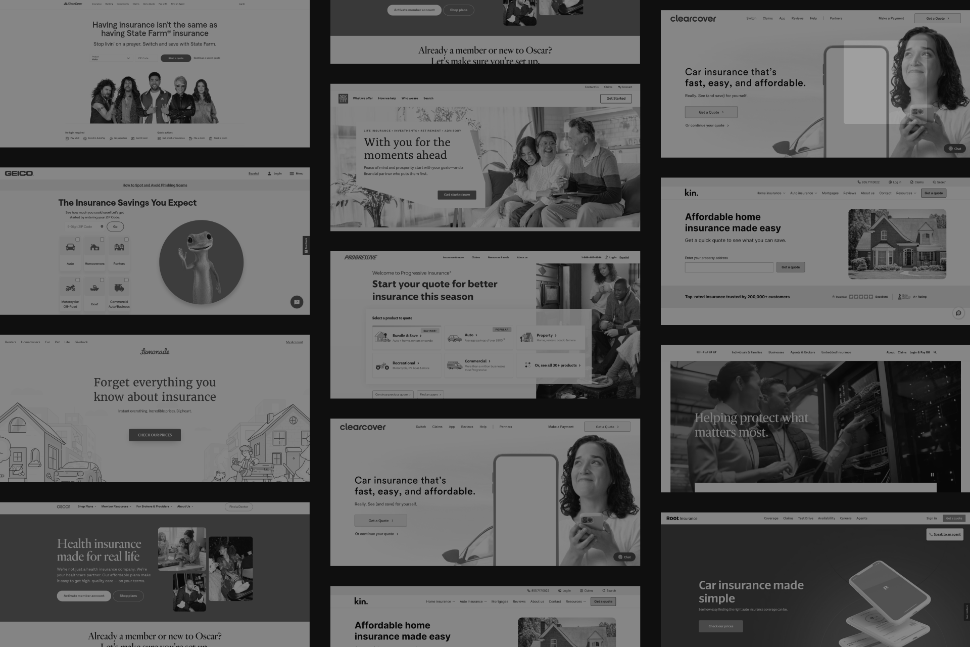
Lemonade (Home, Renters, Pet)
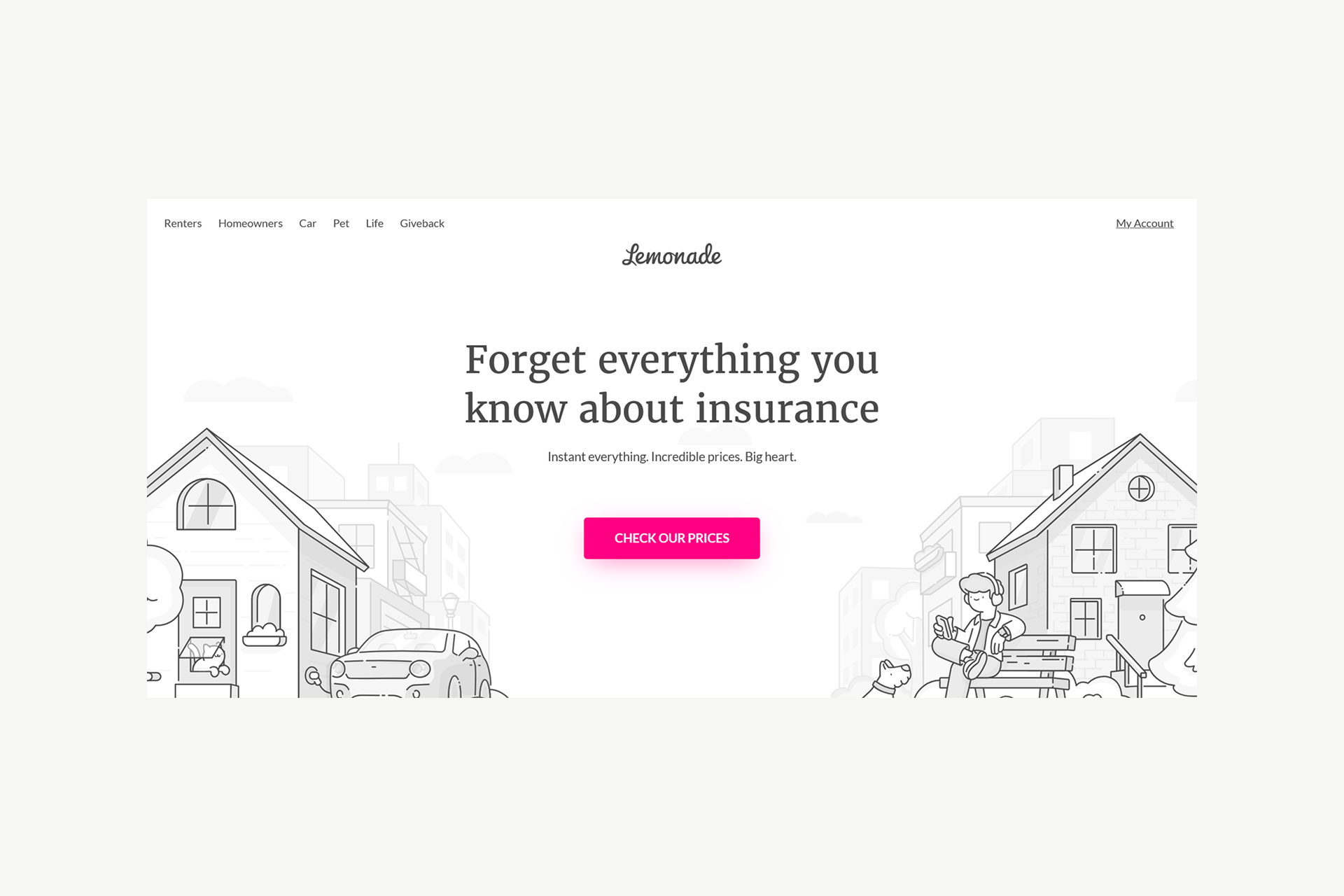
Lemonade has become the main website example in the insurance industry. As mentioned, Lemonade differentiates itself from the competition by moving away from corporate blue to bold pink brand color. Lemonade's design is built around "Maya," an AI chatbot that turns the complex process of purchasing insurance into a simple conversation.
Key Takeaway: Personality and a conversational tone can turn a "boring" necessity into an approachable experience.
Geico (Auto, Multi-line)

Geico used a clear strategy that supports conversion. Their website is fast and inspires users to take action. The famous Gecko mascot is used to humanize the brand, but the real work is done by the prominent quote tool positioned right at the top of the page.
Key Takeaway: If you want high volume, lead with your conversion tool and use your brand personality to keep users from bouncing.
State Farm (Multi-line, Agent-focused)

Even if it’s a company with a massive scale, State Farm manages to feel like a local business. They achieve this by making their agent locator a central feature. While State Farm’s website is modern and sleek, it constantly reminds the user that a real person, a "good neighbor," is available to help.
Key Takeaway: Digital efficiency shouldn't come at the cost of personal service.
Oscar Health (Health)

Oscar Health has a natural, grounded approach with a high-end design and features. Their website is clean, uses custom illustrations, and provides intuitive plan comparison tools that help users understand exactly what they are paying for.
Key Takeaway: Health insurance can feel contemporary and friendly rather than clinical and confusing.
New York Life (Life, Enterprise)

Life insurance is a heavy topic, and New York Life handles it with human-centered storytelling. They use scrolling progress bars and conversational wizards to guide users through educational resources. The design focuses on the emotional "why" of protection.
Key Takeaway: In categories with high stakes, education and emotional connection are the primary drivers of conversion.
Design Trends in Insurance Websites
Design trends today are moving toward extreme clarity. We are seeing a rise in minimalism, where every element on the page has a functional purpose. Custom illustrations have largely replaced generic stock photos of people in suits, helping brands feel more unique and less "corporate."
Also, micro-interactions like subtle animations when you hover over a button provide a sense of responsiveness that modern users expect.
Insurance Design Trends Table
Emerging Trends
Trend Adoption by Company Type
What to Adopt Now vs Later
Note: Don’t chase trends for trends’ sake. Mobile-first design, real-time quotes, clean minimalism, and trust signals remain foundational. AI chatbots are becoming expected. Features like dark mode, advanced personalization, or AR/VR are “nice-to-haves” that can enhance the experience but shouldn’t replace core usability and speed.
User Experience and Conversion Optimization
The stakes for user experience (UX) are incredibly high. Data from the Baymard Institute shows that the average insurance site fails 40% of standard UX guidelines. This failure translates directly to the bottom line: form abandonment in this sector often exceeds 60%.
To combat this, the best designs use "progressive disclosure." Instead of showing a massive form with 30 fields, they ask one or two simple questions at a time. This keeps the user moving through the funnel without feeling overwhelmed.
Conversion Essentials:
- Progress Indicators: Show users exactly how close they are to the final step of the process.
- Save and Continue: Let people walk away and come back without losing their data.
- Trust Proximity: Place security badges and social proof directly next to sensitive input fields (like SSN or bank info).
Inspiration for Small and Large Insurance Companies
The scale of your operation should dictate your design strategy, but it shouldn't limit the quality of the user experience.
Small Companies
For small, local agencies, the goal is to lean into what a massive corporation cannot: community presence. Highlighting local trust signals, such as neighborhood awards or photos of the actual office and staff, builds an immediate "neighbor" connection.
Using modern, template-based solutions can provide a custom look that competes with national brands without an enterprise-level budget.
Large Insurance Companies
In contrast, large corporations must prioritize managing complexity. Their sites need to handle multi-product navigation, branch locators, and robust policy management portals, all while maintaining strict regulatory compliance and accessibility.
Whether you are a local independent like Stone Insurance Agency or a giant like Nationwide, the standard remains the same:
A professional, clean design is the minimum requirement for entry in 2026.
Innovative Features in Insurance Website Design
When exploring websites, you may see that features are moving from static forms to interactive experiences. The most innovative sites now use conversational AI to gather information, making the quote process feel less like an interrogation and more like a consultation.
Inspiring Insurance Website Design Examples
For insurance websites, design is more than just a polished hero section. The key is how a company uses its digital space to solve specific customer problems.
By looking at a broader range of specialists and enterprise carriers, we can see how design language changes based on the target audience.
Additional Case Studies
Progressive
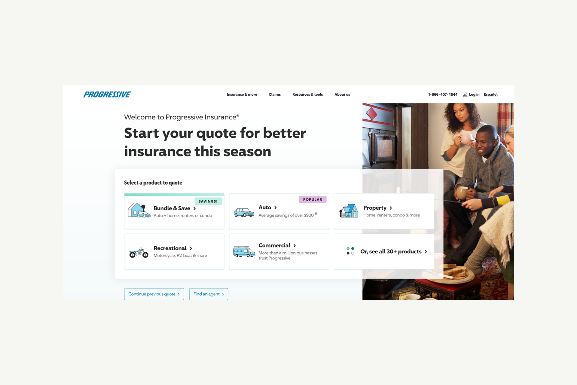
Progressive has mastered transparency. While Flo serves as a familiar, humanizing element, the real power lies in their "Name Your Price" tool and comparison shopping integration. By showing a customer how their rates stack up against others, they use design to build an honest relationship.
Key Takeaway: Honesty facilitated by comparison tools is a powerful conversion tactic.
Kin Insurance
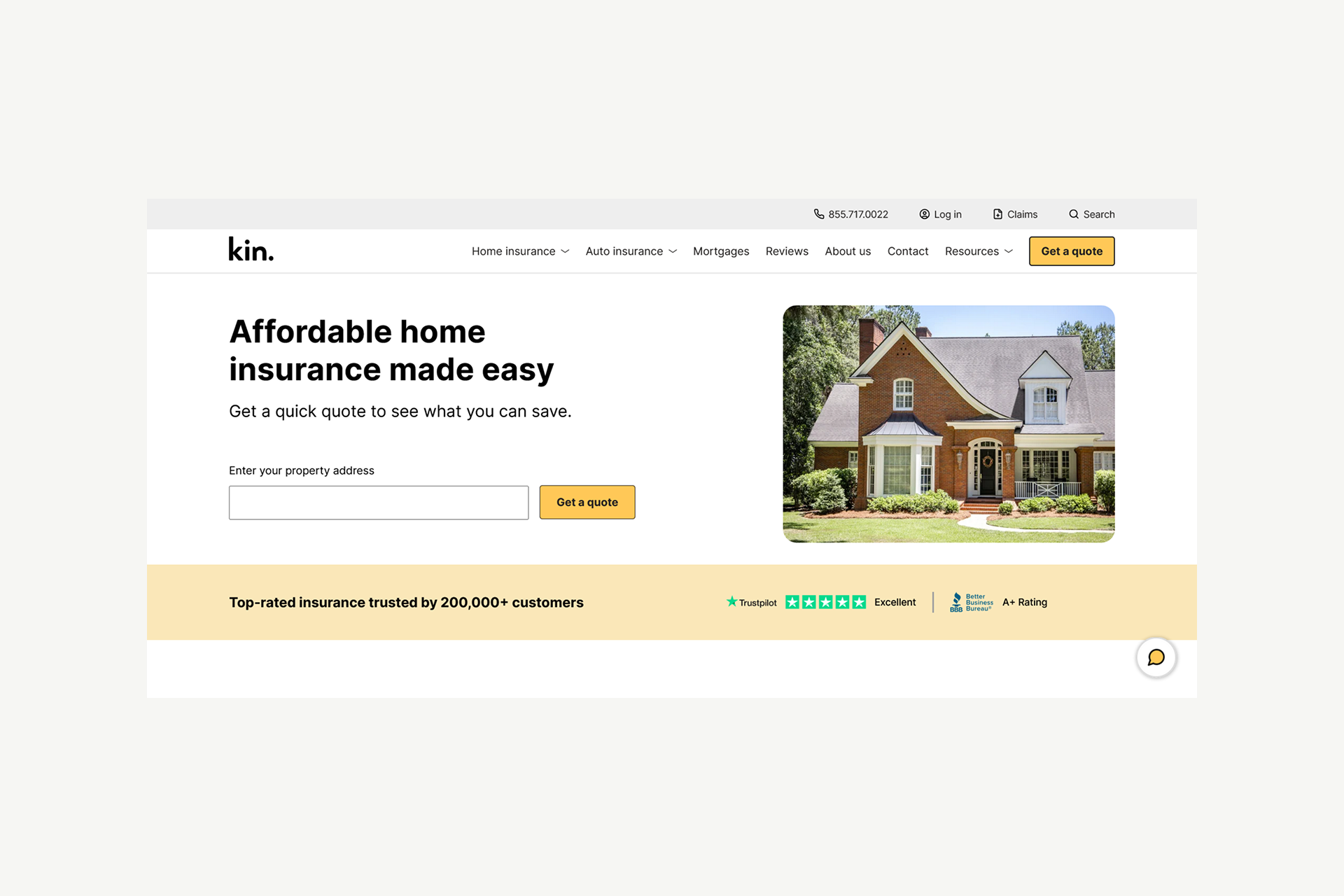
As a homeowners' specialist, Kin uses a niche focus to keep their design remarkably clean. They don't try to be everything to everyone. Their quote flow is stripped of distractions, focusing instead on educating the homeowner about their specific risks.
Key Takeaway: A narrow focus allows for a much cleaner, more efficient user journey.
Clearcover

Clearcover is built for the mobile-first era. Their entire UX is designed around speed, targeting a demographic that wants auto insurance handled in minutes, not hours. The interface is lean, fast, and removes the "legacy" feel often associated with older carriers.
Key Takeaway: Speed and a modern interface can overcome a lack of brand history.
Chubb

Chubb targets high-net-worth individuals, and their design reflects that premium positioning. Using sophisticated video hero sections and a refined, editorial layout, they communicate excellence and attention to detail.
Key Takeaway: Align your aesthetic directly with the tax bracket of your ideal customer.
Root Insurance
root-insurance-website-screenshot / Alt: A screenshot of the Root Insurance website featuring a vibrant, app-style interface designed for a younger, tech-savvy audience.
Root Insurance targets a younger, tech-savvy audience. Their design language is app-first, using vibrant colors and a bold aesthetic that feels more like a Silicon Valley tech firm than an insurance company.
Key Takeaway: Design specifically for your audience's digital habits, not industry traditions.
Balancing Functionality and Aesthetics
The hardest part of a redesign is keeping the site attractive without making it slow or confusing. A site can have the most stunning visuals in the world, but if it takes five seconds to load a quote, it's a failure. The goal is to be feature-rich but not overwhelming.
Performance is a design requirement. In 2026, meeting Core Web Vitals targets is the only way to ensure your site remains visible in search results and functional for users on the move.
Core Insurance Design Principles
Insurance websites succeed when they reduce uncertainty quickly. The design must communicate credibility while helping visitors understand complex coverage options without friction.
Core Design Framework
Design Priorities by Insurance Type
Different insurance categories require slightly different design priorities. Understanding the primary goal helps guide layout decisions and messaging.
The Bottom Line
Insurance customers form trust judgments in under five seconds. Your homepage needs to communicate security, reliability, and professionalism immediately while guiding visitors toward a simple path to get a quote or learn about coverage. Complex products become manageable when design focuses on clarity, speed, and credibility.
Building Your Insurance Website
Navigating the design process for a new insurance site requires a change of perspective. You need a high-performance website that supports your offer even if there are skeptical visitors. Success in 2026 relies on technical excellence and a deep understanding of user psychology.
Design Principles for Insurance Success
To start conversion rates, your design must adhere to a strict set of core values. If the user feels even a moment of confusion or technical lag, the sense of security you are trying to sell evaporates.
Common Pitfalls to Avoid:
- Generic Stock Photography: Customers can spot a "staged" office photo instantly. It erodes authenticity.
- Hidden Pricing: While you can't always give a final price immediately, hiding the process of getting a quote creates frustration.
- Complex Navigation: If it takes more than three clicks to find a phone number or a claim form, your bounce rate will climb.
Next Steps: Building Your Insurance Website
When it comes to the technical build, we recommend Webflow for insurance marketing sites. It provides the perfect middle ground:
- enterprise-grade hosting
- security that satisfies compliance departments
- design flexibility
- Webflow integrations
However, tools alone are not enough. Insurance web design also requires a clear understanding of regulations and the trust signals that shape financial decisions.
At Shadow Digital, we operate as an Enterprise Webflow Partner with deep experience in the financial services sector. We know how to balance the need for innovation with the non-negotiable requirements of security and compliance.
Let’s discuss your project.
Building an insurance website that balances trust, innovation, and conversion requires expertise. Shadow Digital specializes in enterprise Webflow websites for financial services companies.
Contact us
Insurance Website Design Checklist
Trust Elements (Critical)
Conversion Elements (Critical)
UX Elements (Critical)
Content Elements (High)
Technical Elements (Critical)
Before Launch
Shadow Digital's Final Recommendations
Note: “You don’t need everything at launch. Start with Critical items: trust signals, high-conversion elements, and UX basics. A simple, fast, trustworthy site outperforms a complex, slow, feature-heavy one. Iterate based on real data.”
FAQ: Frequently Asked Questions
General
What makes a good insurance website design?
A successful design focuses on reducing the "friction of the unknown." Beyond just looking professional, a good site creates a clear, logical path from the first visit to a completed quote. It uses plain language to explain complex coverage, ensures the most important tools, like quote generators and claims portals, are easiest to find, and loads instantly.
In 2026, a good site is also highly personalized; it speaks directly to the user's specific needs (like renters vs. homeowners) without making them dig through irrelevant content. Ultimately, it's about making a high-stakes decision that feels manageable and safe.
How do insurance websites build trust with users?
Trust is built through transparency and social proof. On a technical level, this means displaying security certifications and third-party ratings (like A.M. Best or Better Business Bureau) near data entry fields. Visually, it involves using real photography of agents and offices rather than generic stock images, which helps humanize a large corporation.
Messaging also plays a role: being upfront about what a policy doesn't cover is often more effective at building long-term trust than over-promising. Finally, a fast, bug-free interface signals that your company is technically competent and reliable.
What are the most important elements of insurance web design?
The most critical elements are a high-conversion hero section, intuitive navigation, and a mobile-optimized quote flow. Your hero section must provide an immediate call to action (CTA), usually a zip code field to start a quote.
Navigation should follow the "three-click rule," allowing users to find claims or support quickly. Additionally, trust signals, such as customer testimonials and clear "About Us" pages, are essential. Lastly, technical performance (speed and accessibility) is the invisible backbone that keeps users from abandoning the site during the quoting process.
Design
What colors work best for insurance websites?
Color choice should align with the brand's specific goals. Blue is the industry standard because it psychologically triggers feelings of stability, calm, and security, vital for legacy carriers. Green is often used for health or life insurance to represent growth and vitality. However, modern brands are increasingly using "disruptor" colors.
For example, Lemonade uses pink to signal they are a fresh, approachable alternative to traditional firms, while white and light gray are used to create a sense of digital clarity and modernism. The key is consistency and ensuring the color palette doesn't distract from the readability of the text.
Should insurance websites use dark mode?
Dark mode is becoming more common, especially for companies targeting a younger, tech-savvy demographic. It can give a site a premium, sophisticated feel and is easier on the eyes for users browsing at night.
However, it should usually be offered as a toggle or a secondary option rather than the default. Insurance requires heavy reading of fine print and tables, and high-contrast black text on a light background is still the gold standard for long-form legibility and accessibility. If you choose a dark aesthetic, ensure your "Trust" elements and CTAs still pop against the darker background.
How important is mobile design for insurance?
It is no longer optional; it is the primary way many users interact with your brand. With over half of all web traffic coming from mobile devices, your "mobile-first" strategy determines your conversion rate. A quote form that is easy to type into on a desktop but frustrating on a touchscreen will lead to immediate abandonment. Mobile design requires larger buttons, simplified menus, and an extremely lightweight build to ensure fast loading over cellular networks. If a user can't manage their policy or start a claim from their phone while standing on the side of the road, the design has failed its most basic utility test.
Examples
What is the best insurance website design?
There is no single "best" site, as the "winner" depends on the goal. For pure conversion and speed, Geico is often cited as the gold standard because of its aggressive focus on the quote funnel. For brand personality and ease of use, Lemonade is the industry leader, having successfully turned a complex financial product into a friendly, conversational experience.
For health insurance, Oscar Health stands out by making a confusing system feel as simple as a lifestyle app. The best design for your company is the one that most effectively speaks to your specific audience's pain points.
Why is Lemonade's website considered well-designed?
Lemonade broke the traditional "corporate" mold by using a minimalist, conversational interface. Instead of forcing users to navigate complex menus, they use an AI chatbot named Maya to guide them through a series of simple questions. This "one-thing-at-a-time" approach prevents the cognitive overload that usually comes with insurance forms.
Their use of vibrant colors, custom illustrations, and transparent language about how they use premiums (including their "Giveback" program) creates a sense of community and social good that traditional insurers often lack. They turned a transaction into a relationship.
What insurance websites should I use for inspiration?
Look at a mix of disruptors and established leaders. Study Lemonade for conversational UI and Oscar Health for app-like simplicity. For high-volume conversion patterns, look at Progressive and Geico. If you want to see how to handle premium, high-net-worth branding, Chubb is an excellent example of editorial-style excellence.
For small agencies, look at Kin Insurance to see how a niche focus allows for a much cleaner, more streamlined layout. Finally, check Insurify to see how comparison tools can be integrated into a clean, modern interface.
Practical
How much does an insurance website cost to build?
Cost varies significantly based on the level of integration required. A custom-designed marketing site for a local agency using a platform like Webflow might range from $5,000 to $15,000. However, for mid-sized to enterprise carriers needing custom quote-engine integrations, policyholder portals, and high-level security compliance, costs can range from $50,000 to well over $200,000.
The primary cost drivers aren't just the visual "skin" of the site, but the backend complexity, the number of unique page templates, and the rigorous testing required to ensure the site is accessible and compliant.
What platform should insurance companies use for their website?
For marketing-heavy sites that need to be fast, secure, and easy to update, Webflow is the top recommendation in 2026. It offers enterprise-grade hosting and allows for high-end custom design without the "bloat" of traditional CMS platforms like WordPress, which can be a security risk if not perfectly maintained.
For larger companies with massive internal databases, a headless CMS approach (like Contentful paired with a React frontend) is often used to pull in real-time policy data. Regardless of the platform, it must support SSL encryption, fast CDNs, and robust accessibility features.
How long does it take to build an insurance website?
A standard professional redesign usually takes between 8 and 16 weeks. The first 4 weeks are typically dedicated to strategy, site mapping, and wireframing, ensuring the "logic" of the quote flow is sound. The next 6 to 8 weeks focus on visual design and development.
The final period is critical for insurance: it involves rigorous compliance reviews, accessibility testing (WCAG), and speed optimization. For enterprise-level sites with complex API integrations for real-time quoting, the timeline can extend to 6 months or more to ensure every data point is handled securely.