Best Banking Website Design Examples 2026: Trends, Inspiration & Best Practices

Let's Build Your Webflow Website!
Partner with experts who understand your vision. Let’s create a converting user experience and build your website for future growth.
Your bank's website is the branch. For most customers, it's the only branch they ever visit. If it's slow, cluttered, or unclear, they leave. Not to call support. Not to try again. They leave to a competitor whose site takes 3 seconds to answer the question yours buried in a dropdown.
This is a breakdown of the best banking websites operating right now, what they're doing right, and what the gap between them and everyone else actually looks like.
Why banking website design matters in 2026
Impact on trust, conversion and customer retention
Banking websites carry more trust weight than almost any other category. Before someone hands over their financial life, they're reading signals. Not consciously. But they're reading them.
A site that feels dated signals: the product might be dated too. A cluttered navigation signals: the bank doesn't know who it's talking to. A hero section that leads with stock photography of smiling families signals: nobody made a decision here.
The reverse is also true. A fast, clear, honest website does real conversion work before a single form field appears.
Key challenges: security perception, compliance, mobile
Banks face a design problem most SaaS companies don't. They have to feel safe AND feel simple. These two things pull in opposite directions. Overdoing security messaging creates friction and anxiety. Underplaying it loses trust.
Add regulatory compliance requirements, accessibility mandates, and the fact that a meaningful portion of users are completing high-stakes transactions on a phone with patchy signal, and you have a product design challenge most agencies underestimate.
Digital banking adoption: where the numbers are
The global digital banking platform market was valued at roughly $37.5 billion in 2025. It's projected to reach $44 billion in 2026 and $155 billion by 2033. The growth rate sits around 19.8% annually.
76% of consumers choose digital banking. 54% prefer mobile specifically. Around 1.8 billion customers are now served by digital banks worldwide.
These numbers matter for one reason: the bar is higher. Users aren't new to digital banking. They've experienced good and bad. They know what frictionless feels like, and they'll notice when your site doesn't have it.
Key banking website design trends for 2026
Mobile-first and responsive design
Mobile-first used to be a best practice. Now it's table stakes. A site designed for desktop and "also made responsive" is a different thing from a site designed for mobile and scaled up. Users feel the difference.
The best banking sites in 2026 are designed for the thumb first. CTAs within reach. Forms that don't require pinching. Menus that don't collapse into mystery-meat hamburger icons.
AI-powered personalisation
Personalisation in banking websites has moved past "Hello, [first name]." The better examples now serve different homepage experiences based on what a user already holds with the bank, what they've been searching for, or where they are in a product consideration cycle.
This isn't just a conversion play. A customer who sees their actual account balance and a relevant next action when they log in has a fundamentally different relationship with that product than someone who sees a generic marketing homepage. For a broader view of where the web is heading, see our breakdown of web development trends.
Trust signals: biometrics, badges, transparency
The trust signals that work in 2026 are specific and honest. Not "bank-grade security" in a footer badge. Actual explanations of how data is stored, where it's protected, what happens if something goes wrong.
FDIC and FSCS indicators, SSL certificates, and transparent fee displays have moved from differentiators to hygiene factors. The banks standing out are those communicating security in plain language, not just asserting it with icons. The best cybersecurity website design examples apply the same principle: specificity over assertion.
Minimalist design with micro-interactions
Minimalism in banking has a specific function: it removes anything that creates cognitive load at a moment when the user is trying to make a financial decision. Every visual element competes for attention. Fewer elements means faster comprehension.
Micro-interactions do the other job: they confirm. A toggle that animates tells you it changed state. A form field that turns green when validated removes the question "did that work?" These are small things. Their absence is noticeable.
Dark mode, gradients and modern colour psychology
Dark mode in banking is no longer a neobank novelty. Traditional institutions are adopting it because their users expect the option. The better implementations aren't just inverted colour schemes, they're genuinely redesigned for legibility in low-light conditions.
Gradients are back in a specific way: not the early-2000s chrome effect, but subtle colour transitions that create depth and visual interest without adding complexity. Revolut uses this well. So does Stripe.
Voice, conversational UI and gamification
Conversational elements, things like AI chat assistants that understand context rather than routing you to a FAQ tree, are separating forward-thinking banks from legacy implementations.
Gamification shows up primarily in savings products. Progress bars, milestone markers, and visual feedback on goal completion drive engagement without trivialising the product.
Best traditional bank website examples
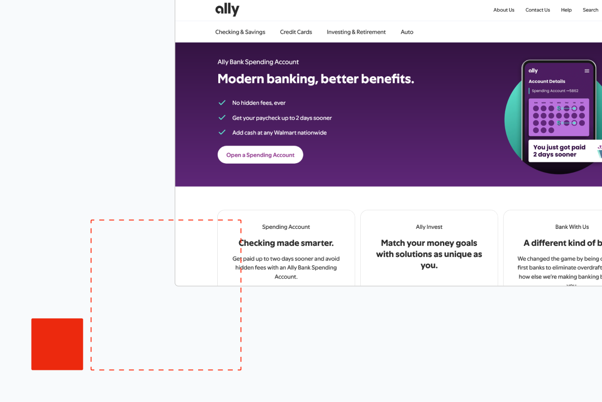
Ally Bank: simplicity and approachable innovation
Ally Bank's website earns its reputation. The homepage is not trying to do everything. It has a clear hierarchy: who this is for, what you get, why it's different, how to start.
What Ally gets right is the tone-to-design ratio. The copy is direct and plain. The design supports that directness rather than fighting it. No hero section with five competing messages. No navigation that opens to a wall of products.
The mobile experience is clean. The account comparison tool gives real information without requiring you to decode industry language. Ally has understood that "approachable" in banking doesn't mean playful, it means honest.
Chase Bank: professional navigation and trust-building
Chase is managing a complexity problem that Ally doesn't have. It serves retail customers, business customers, investors, mortgage holders, and everything between. The navigation is genuinely difficult to solve at that scale.
What Chase does well: the site feels trustworthy on load. The visual weight is right. The brand signals stability without feeling fossilised. The personal and business navigation split is cleaner than most banks of its size.
Where it struggles: product pages lean on financial services language that doesn't translate for newer users. The mobile experience is functional but not fluid.
Capital One: clean CTAs and user convenience
Capital One's website is one of the better examples of a traditional bank applying product design thinking. The CTAs are clear and singular. You never land on a page unsure of what you're supposed to do next.
The card comparison tool is one of the more usable in the industry. It actually compares. No obscured APR information, no hidden-fee asterisks you have to squint at.
The homepage hero rotates product messaging but maintains a consistent visual logic that keeps it from feeling chaotic. It's a small thing. Most rotating hero sections feel disjointed.
Other notables: Discover and Berkshire Bank
Discover's website is underrated for clarity. The cashback rewards explanation, which is notoriously confusing across the industry, is presented with actual specificity on Discover's site. Numbers, conditions, and terms visible before you apply.
Berkshire Bank is a notable regional example: a smaller institution that has invested in a clean, well-structured site that punches above its category. The community banking language is specific rather than generic, which is rare.
Best neobank and fintech website examples
Revolut: sleek, multi-product global appeal
Revolut has one of the hardest design problems in the category. It offers currency exchange, crypto, stock trading, insurance, and banking across dozens of countries. The homepage could easily collapse under that weight.
It doesn't. The design is restrained, fast, and hierarchically clear. The hero section names the product without over-explaining it. The feature breakdown below the fold uses motion well: scroll-triggered reveals that pace the information rather than dumping it.
The dark aesthetic is on-brand and consistently executed. It doesn't feel like a financial product that decided to look like a tech product. It feels designed from a single point of view.
Wise (formerly TransferWise): transparency and bright branding
Wise built its brand on fee transparency at a time when every other money transfer service buried its fees in the terms. The website reflects that. The fee calculator is the hero. It's the first thing you interact with.
That's a design choice, not a UX choice. It says: we're confident enough in our pricing to make you look at it immediately.
The branding is distinctive in a category that defaults to blue and grey. The colour choices are bright but not juvenile. The site communicates that Wise is for people who want to understand what they're paying, and the design doesn't contradict that message.
Mercury, Wealthsimple and Stripe
The best fintech website design examples right now share a common thread: they trust their audience with real information. Mercury is the benchmark for B2B fintech web design right now. The site is clean to the point of austerity, which is exactly right for its audience: founders and finance teams who want a banking product that feels like a product, not a service.
The copy is technical when it needs to be and plain when it doesn't. There's no attempt to simplify away from the actual user. The design trusts its audience.
Wealthsimple does something interesting: it uses photography of real customers in situations that feel unstaged. Investing doesn't have to look aspirational to the point of abstraction. The brand warmth is genuine rather than performed.
Stripe is technically payments infrastructure rather than consumer banking, but its website sets the standard for how fintech communicates complexity to technical and non-technical audiences simultaneously. The developer documentation and the marketing site exist in the same design language.
Chime and N26: pure digital experiences
Chime's website is designed for one user: someone who has been underserved or overcharged by traditional banks and is looking for an alternative. The messaging is specific. "No monthly fees. No minimum balance." Not "experience better banking." Specific claims.
N26 brings European design rigour to mobile banking. The site is well-paced, the typography is clean, and the product screenshots are integrated into the layout in a way that feels like demonstration rather than decoration.
Head-to-head: what makes them stand out
Navigation and information architecture
Hero sections and CTAs
The banks with the strongest hero sections share one characteristic: they commit to a single message. Ally commits to its rate. Wise commits to its fee transparency. Mercury commits to the product audience.
The weakest hero sections try to serve everyone at once. Five value propositions, three CTAs, a rotating banner. The result is that users read none of it.
Trust and security indicators
Effective trust signals in 2026:
- FDIC/FSCS insurance displayed in plain sight, not buried in the footer
- Security explanation in plain language, not badge assertions
- Fee transparency that doesn't require a calculator and a lawyer
- Real customer reviews with specific details, not generic star ratings
Weak trust signals: "bank-grade encryption," stock photography of padlocks, and footer text that says "your deposits are protected" with no further explanation.
Mobile experience and accessibility
The gap between best and average is widest on mobile. The best examples, Revolut, Wise, Chime, were designed for mobile first. Everything is within reach. Forms are short. Loading is fast.
WCAG 2.1 AA compliance is a legal requirement in most markets. The accessibility quality on financial sites varies dramatically. Screen reader compatibility, sufficient colour contrast, and keyboard navigation aren't optional; they're the floor.
Personalisation and interactive tools
The interactive tools that drive engagement:
- Rate calculators with real numbers
- Fee comparison tools (Wise's is the category benchmark)
- Product matching questionnaires that give specific recommendations
- Account dashboards that surface relevant actions on login
These tools do conversion work that no static landing page can do. They also signal confidence: "we're showing you the numbers because we think you'll like them."
Loading speed and performance
Google Core Web Vitals are a ranking factor and a trust signal. A banking site that loads slowly signals technical debt. It makes users wonder what else hasn't been maintained.
Mercury and Wise both load fast. Chase and some traditional institutions carry the weight of years of accumulated third-party scripts and marketing technology. That weight shows.
Best practices for banking website design
Building trust: FDIC, SSL and social proof
Trust-building in banking is specific. FDIC insurance display, SSL certificate visibility, and security protocol explanation convert visitors who would otherwise hesitate. Generic "we take security seriously" language doesn't. Specifics do.
Customer testimonials work when they're specific. "I moved my savings here in 2023 and earned $800 more than I would have at my old bank" works. "Amazing experience, highly recommend" doesn't.
UX and UI tips for conversions
The single highest-impact change on most banking websites is simplifying the account opening flow. Every field that isn't legally required is a drop-off point. Every step that could be two steps is a drop-off point.
The second highest-impact change: one CTA per page. Not three CTAs in different colours suggesting the same action. One.
Accessibility and inclusive design
WCAG 2.1 AA compliance means:
- 4.5:1 contrast ratio for normal text
- Keyboard navigable interface
- Screen reader compatible markup
- Alternative text for all meaningful images
- Form labels that work without colour cues
These aren't design constraints. They're the minimum. Banks that treat accessibility as optional are a legal risk and a missed market.
Integration with mobile apps and omnichannel
The website and the app need to feel like the same product. When a customer starts an account opening on the website and completes it in the app, the experience should be continuous. Most banks fail this. The handoff is rough. Data doesn't carry. The visual language changes.
The banks that get this right, Revolut and N26 are the clearest examples, treat web and mobile as a single product with different form factors, not two separate products. If your bank is rebuilding from scratch, Webflow development and design is worth considering as the foundation for that unified experience.
SEO, security and compliance
Banking websites carry specific SEO complexity. YMYL (Your Money Your Life) content is subject to stricter quality evaluation by search. E-E-A-T matters more here than in most categories.
That means: author credentials displayed, sources cited, claims substantiated, and content genuinely written for the user rather than the algorithm.
How to audit your banking website
Work through this in order. Don't skip to the interesting bits.
Step 1: Speed Run Google PageSpeed Insights on your homepage, your primary product pages, and your account opening flow. Any page scoring below 70 on mobile is costing you conversions. Fix the largest contentful paint and cumulative layout shift issues first; they have the most direct impact on user experience.
Step 2: Navigation audit Can a user who has never heard of your bank find your primary product, understand what it costs, and start an application in under 60 seconds? Time yourself. If you can't do it in 60 seconds, your users can't either.
Step 3: Mobile audit Pull out a phone. Not your phone; you know the site too well. Give it to someone who doesn't. Watch them try to complete a specific task. Don't help them. Note where they hesitate.
Step 4: Trust signal audit List every trust claim on your homepage. For each one, ask: is this specific or generic? "Your deposits are FDIC-insured up to $250,000" is specific. "We take your security seriously" is generic. Replace every generic claim with a specific one or remove it.
Step 5: CTA audit Count the CTAs on your homepage. If there are more than two primary CTAs, you have a decision problem. Users presented with multiple equivalent options choose none of them. Commit to one primary action per section.
Step 6: Accessibility check Run your site through WAVE or axe DevTools. Fix every error. Fix the contrast warnings. This takes less time than you think and carries legal risk if ignored.
Step 7: Content audit Read every sentence on your homepage out loud. Cut every sentence that could appear on any other bank's website without modification. If it's generic, it's doing nothing. Replace it with something specific to your product, your rates, or your customers. If you want to see what a well-executed bank site looks like in practice, our work shows the before and after.
Common mistakes to avoid
Overly complex navigation is the most common structural problem in banking websites. It usually develops over time: a product gets added, a new audience segment gets a menu item, a compliance page needs to be findable. After five years, the navigation is a document. Users who want your product can't find the CTA because they're in the table of contents.
Weak mobile optimisation shows up in two ways. The first is obvious: the site is technically responsive but the layout breaks or text becomes unreadable at phone dimensions. The second is subtle: the site renders correctly but was never designed for mobile interaction. Tap targets are too small. Forms are too long. The checkout flow requires too many steps.
Missing trust signals is the problem that costs the most conversions without announcing itself. The user doesn't leave saying "I didn't see an FDIC badge." They leave with a vague sense that something felt off. The specific absence of trust signals creates a general feeling of distrust.
Financial jargon on marketing pages is the miscalculation of assuming your marketing audience shares your vocabulary. APY, LTV, HELOC, and similar terms mean something specific to people who already understand them. To everyone else, they're a signal that this bank isn't talking to them. Define terms. Or better: don't use them above the fold.
Ignoring load speed is a compounding error. Every third-party script added for marketing analytics, personalisation, or tag management slows the site. Nobody notices until the cumulative weight creates a three-second load time. By then, removing the scripts is a political project, not a technical one. Build governance around performance from the start.
Future outlook: banking web design beyond 2026
The pattern running through everything coming next is that the website stops being a brochure and becomes a product.
AI agents that can answer specific questions about a user's account, model scenarios, or complete transactions without navigating to a new page are already in early deployment at the larger institutions. The quality gap between those implementations and what a user can do at a human teller is narrowing.
Biometric authentication is becoming the web experience, not just the app experience. FaceID and fingerprint login moving from mobile app to browser removes the friction that makes users avoid desktop banking.
Immersive financial planning tools, things like visual budgets, scenario modellers, and goal-progress dashboards, are starting to be integrated into marketing sites, not just account dashboards. The distinction between "are you considering this product" and "you have this product" is blurring by design.
The banks that treat their website as a product, with a product manager, a design system, and a continuous improvement cycle, will separate from those treating it as a marketing asset updated twice a year.
Contact Shadow Digital | See Our Work
Frequently asked questions
What are the best banking website design examples in 2026?
Ally Bank, Revolut, Wise, Mercury, and Capital One are consistently strong. Ally leads for clarity and approachability. Revolut for visual design and mobile experience. Wise for transparency and tool-first design. Mercury for B2B banking. Capital One for CTA clarity and product comparison.
What design trends are dominating banking websites this year?
Mobile-first architecture, AI-driven personalisation, transparent fee displays, minimalist layouts with purposeful micro-interactions, and dark mode support. The shift from "secure-looking" to "genuinely transparent" is the underlying direction across all of them.
How do neobanks design better user experiences than traditional banks?
Neobanks were built without legacy architecture. They didn't inherit 15 years of accumulated pages, compliance overlays, and navigational debt. They designed for mobile from day one, have single-purpose product sets, and tend to have tighter design governance. Traditional banks can close the gap, but it requires treating the website as a product rather than a marketing channel.
Why is mobile-first design critical for banking websites?
54% of users prefer mobile banking. A site that works on mobile as an afterthought, rather than as the primary design target, creates friction exactly where users expect fluency. In a category where trust is everything, friction is expensive.
What trust signals should every bank website include?
FDIC or equivalent insurance displayed above the fold. SSL certificate indicator. Fee transparency, specifically: what does this product cost and under what conditions. Specific customer testimonials with verifiable details. Clear explanation of data protection in plain language.
How can banks improve website conversions and user engagement?
Reduce form length in account opening flows. Cut CTAs to one primary action per section. Replace generic value propositions with specific claims and numbers. Add interactive tools that let users model their own outcomes. Fix mobile load speed. All of these compound.
Which elements make Ally Bank and Chase stand out in design?
Ally's strength is restraint and specificity. The site doesn't try to do too much. Chase's strength is its handling of complexity at scale, segmenting a very large product set into a navigation that remains navigable, though it has room to improve product page clarity.
How do I audit my bank's website for 2026 standards?
Start with Google PageSpeed on your core pages. Then do a timed navigation test with a first-time user. Run an accessibility check with WAVE or axe DevTools. Read every homepage claim and remove anything generic. Count CTAs per page and reduce to one primary. These five steps will surface the highest-priority problems faster than any tool wil