Webflow Components: The Scalable Design System Guide


Let's Build Your Webflow Website!
Partner with experts who understand your vision. Let’s create a converting user experience and build your website for future growth.
Webflow Reusable Components: The Complete Guide for Scalable, Consistent Design Systems
The first Webflow website you put together feels very smooth, and the build usually starts very tidy. Often, the choice is made fast. The setup is tracked, and the whole thing just works.
But then there comes the website number two, or your client needs edits across like 20 pages at once. Or even you bring a junior designer onto the project and realize you have to explain the same button style three different ways (because no one left notes on why they even exist).
That’s where things start to wobble. Here, reusable components are fixed so that they’re not some nice design idea. They’re the base layer that keeps your setup from folding and on itself as it grows.
When you build with components, from day one, you’re not just keeping your layout tidy and clean; you’re creating the setup for your team to use it without breaking stuff.
In this guide, we will show the real process of reusable components; we’re not going to rely only on theory or wishlist talk. We will focus on steps for building usable components in Webflow, the patterns that hold up a scale, and the mistakes that take a project down before anyone sees the warning sign.
If you’re making anything bigger than a one-page website or you’re working with a theme, maybe touching the same element more than once, this is for you.
Understanding Webflow Reusable Components

First, let’s define what Webflow components are. If you’re familiar with the platform, you’ve probably used them, but for someone who is not 100% sure what they are, they are blocks you can reuse anywhere on the website.
For example, you set something up, maybe a nav bar or card, and turn it into a component. Once you update the main, every copy follows your update. This makes the process clean, simple, and consistent.
In practice, that’s the surface of components. The real shift happened when Webflow replaced Symbols. Symbols were pretty much like components we use today, and they worked very well, but they were a bit stiff. The reason for this is that every instance had to match the original, so if you needed a small week, you either made a bunch of duplicates or broke the connection.
For long-term use of the platform and growth, these were simply bad.
Now, components, fix that by letting you choose what can change. You can lock the structure, then expose a few properties like color, text, or link, and get 50 versions of a button across the website - all connected and consistent, but original.
This feature gave us the possibility to design freely and to tackle technical issues before we jump into the project. Also, it saves time and prevents the process from returning to a mess.
Components in Practice
In practice, it’s simple. Let’s use an example, and say you're building a SaaS site for a client.
You create a "Feature Card" component. It has an image, a headline, a description, and a link. Those elements are all part of the structure, and they stay the same. But you expose properties for the image itself, the headline text, the description text, and the link destination.
Now, a designer or even the client can create variations of that card across the site without ever touching the component itself. Same spacing, same typography, same hover effects. Just different content.
Webflow components are essential, and even if it takes time to create them, they keep everything aligned without endless Slack threads.
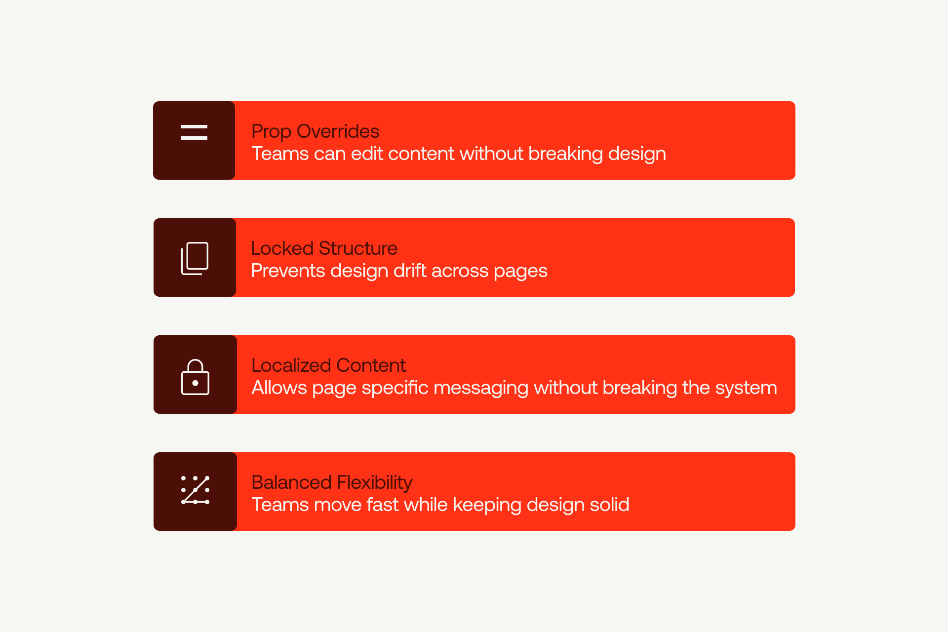
Key Features That Make Webflow Components Powerful
Webflow components have two parts: the base and the instances. The base is the source. It holds the layout, styling, and rules. When you update it, every instance updates. That’s how you keep things aligned.
Instances are the versions you drop on pages. They stay linked to the base but let you swap content or small settings you’ve allowed. Nothing visual changes unless you expose it on purpose.
The real power comes from choosing what stays locked and what stays flexible. If you expose the right stuff, teams can work fast without breaking the setup.
Here’s a breakdown of the key features that make them work.
Benefits of Using Reusable Components in Webflow
You already understand why using Webflow components is beneficial for the website and for the teams, but to sum it up, the key benefits of components are:
- System consistency - you will notice that everything is straight up, and everything is looking and acting the same. Buttons behave the same, cards lineup the same, shadows, spacing, interactions, all match. If someone is moving from page one to page 40, get one clear experience, not a clunky vibe. And for the SaaS teams and bigger organizations, this is a must.
- Time saving - Components are a long-term investment when it comes to time. Yes, the first build takes a bit more effort, a bit more hours spent, but after that, it just flows.
- Brand consistency - Brand consistency becomes automatic. In SaaS, an enterprise brand is a part of how people judge the project; if each page feels slightly different or it looks unsteady, it will hurt trust. If there’s one blue button, that’s the blue button. If heading styles are fixed, your type setup stays clean, no matter who edits it.
Webflow website builder is known for great teamwork, so for teams running multiple websites under the same brand, this is a difference between something you can scale and something that eats your bandwidth.
Common Use Cases in Real Webflow Builds
In Webflow, some components pop up on almost every site. Locking their structure while letting your team update content can save hours and keep designs consistent.
Here’s a breakdown of the most common components and how to handle them.
A quick but important note for any component that contains an image slot: make sure Webflow's Responsive Image Feature is active. This ensures every image inside a component auto-generates the right sizes for different breakpoints. Without it, hero images and card images can load too large and slow the page down.
Best Practices for Managing Webflow Reusable Components
Infografic here - alt text webflow reusable components infographic
In the following lines, you can find the best practices for managing reusable components in Webflow:
Structuring and Organizing Your Component Library
You know, a pile of great building blocks isn't helpful if you can't find the one you need. That's why organization is key.
The Component Hub Page
Every successful component library needs a Component Hub.
This Hub is essentially a single staging page on your site where you show every single component you have. Think of it as a gallery or a catalog. On this page, you display all the different versions and conditions of each block.
A button component would show all its sizes, colors, and states (like how it looks when you hover over it or when it's disabled).
A content card might show versions with long text, short text, or different picture shapes.
This Hub does two important things:
- It's a clear reference for your team. Anyone new can see exactly what exists and how to use it without having to guess.
- It's a quality check. If something looks weird or out-of-place on this Hub page, you catch the mistake there before it ends up broken on dozens of pages across your live website.
Naming Conventions: Clarity is Everything
Beyond the Hub, how you name things determines whether your library is easy to maintain or a confusing mess.
The standard approach most designers use is called Client-First. It’s a reliable, tested way to name your classes using a predictable structure. It works for almost every project because it’s consistent across the industry. When you work with outside clients or different teams, sticking to this system makes collaboration smooth.
For bigger or more specialized builds, you can also use an advanced, system-agnostic naming strategy. This is the kind of internal approach teams like ShadowDigital use when they need more control than Client-First offers. It keeps naming consistent across large ecosystems without locking the team to one single framework.
However, the most important rule, though, is simple: Choose one naming system and stick to it. Changing how you name components halfway through a project is a recipe for confusion and makes it extremely difficult for anyone on the team to find what they're looking for.
Creating and Managing Component Variations
Now let’s talk about how to make your components flexible. The first thing we need to define is that this is what we call variants - just different styles or setups of the same component.
For example, a button isn’t just one thing. Yes, it might need a primary look for the main action and a secondary look for less important actions, so a card might come in a compact version of an expanded version.
Instead, you can create one sentence for the bottom component, then you set up what we call a style property that lets you choose its look. You pick primary, secondary, tertiary, or ghost from a menu. The button structure stays directly to safe, with only visual styling changes.
This means a designer just picks the single button component and chooses the style they need rather than scrolling through a long list of identical parts.
If you’d rather have this cleaned up by professionals, the Shadow Digital Webflow development experts can step in and handle the mess.
You can use the same technique for other needs:
- Expose a "Size" property to select small, medium, or large.
- Expose an "Orientation" property to switch between a horizontal or a vertical layout.
- Each of these variations is simply a different way to configure the same core component.
This method keeps your library lean. Instead of keeping track of fifty different components, you're managing maybe ten components, each with a few different variants. It’s cleaner, simpler, and much easier to update later.
A Word of Caution
Now, a quiet warning: too many variants can actually hurt you.
It’s a common mistake for beginners to try and expose every single possible setting as a property. If you end up with one component that has twenty different configuration menus, you haven't built a reusable block, you've built a confusing, overly complex tool.
Keep it simple. Stick to the most common configurations your team actually needs. For those rare, one-off situations, it’s usually better to let the designer combine simpler elements rather than trying to build a complex variant for every single edge case.
Workflow Optimization With Reusable Components

Building websites changes when you commit to using components. You stop designing one-off elements and start assembling pages from pre-made, high-quality blocks.
The process is fast: Go to your Component Hub, grab the components you need, place them on the page, adjust the few properties you set up (like size or color), and you’re done. No need to build or style anything from scratch. You’re simply combining parts.
This is where you see real-time savings. A page that might take three hours to style the old way can be built in thirty minutes with components. The styling and interactions are already finished. You are just arranging and adding content.
The other huge benefit is global updates. If a button needs better spacing, or a card needs a slightly different shadow, you only update the main component one time. Instantly, every page that uses that component updates automatically. A change that would have meant editing fifty separate pages now takes just a few minutes.
This is invaluable when working with clients. Instead of saying, "That small revision will take us a week," you can often say, "It's already fixed and live," because the update propagated immediately.
Note: Webflow Optimize can help here too by letting you test different variations of your pages and see which changes actually drive engagement, all without touching custom code.
Ensuring Scalability and Long-Term Efficiency
A good component needs to be ready for the future.
When you build a component, pause and think about what might change later. Maybe that basic button will need to support an icon in six months. Maybe that card will need a new, expanded layout next quarter. Design the component with these possibilities in mind. Expose the properties that are likely to be flexible, and lock down the structure that should never change.
This doesn't mean predicting the impossible. It means being smart about separating the essential core of the component from its small details.
Global Style Variables (Design Tokens)
This is how you keep your system flexible at scale. Design Tokens are essentially variables for design attributes like color, font size, and spacing across your entire site.
When your components use these tokens, a single update to the token changes everything that uses it.
Here’s a clear example: Design Tokens make theme switching dead simple. If your site supports dark mode, you don't rebuild components or restyle each element. You just change the variable values. A token like background-color switches from light to dark, and every component that uses it updates instantly. This keeps your design consistent without hours of manual edits.
This ability to change tokens to update your entire site makes managing themes, brands, or color changes incredibly simple.
Troubleshooting and Iterating on Components
Over time, components sometimes need fixing or rethinking. If a component works for ten uses but breaks on the eleventh, you need to decide: refactor (fix the existing component) or rebuild (start fresh).
Use three simple factors to decide:
- Complexity: How many properties and moving parts does the component have? If it’s already complex, patching it (refactoring) often just makes it more fragile. A fresh rebuild might be cleaner.
- Usage Count: How many pages currently use this component? If it's used fifty times, an error during refactoring is risky. If it's used three times, rebuilding is a low-risk option.
- Performance Impact: Does the component affect how fast the page loads? If speed is critical, you should prioritize simplicity, which sometimes means a clean rebuild over patching old code.
If all three factors point toward low risk, refactor. If they point toward high risk, rebuild.
Advanced Workflows for Component-Driven Sites
In Webflow, your components can be smart enough to respond to your CMS content.
The trick is binding component properties to CMS fields. For instance, you can bind a button's visibility property directly to a "Show Button" checkbox in your CMS. When a content editor checks the box, the button appears. If they uncheck it, the button disappears. They don't touch the component itself.
This lets non-technical editors control component behavior just by updating a CMS item. You build the component once, and it reacts automatically to the data you feed it.
Architecture for Large Sites (Enterprise)
For large-scale or enterprise sites, organize components not by what they look like, but by what they do in the user journey. Group them as awareness components, consideration components, or decision components. This helps the team think about context.
A major benefit here is the prevention of custom class clutter. Without components, editors often add custom classes for one-off tweaks, like "bigger-red-button." This bloats your styling files and leads to conflicts. With components, editors must use the variants you provide. If a new style is needed, you update the component once, and the styling remains controlled and clean.
Common Component Mistakes (and How to Avoid Them)
Here are the most common mistakes that can happen and clear steps on how to avoid them:
- Overusing Components: Don't make everything a component. If you won't use it at least twice, just build it as a regular element. Making one-off elements into components adds unnecessary maintenance.
- Naming Inconsistencies: Naming components "Button 1," "Button Red," and "Button Large" leads to chaos later. Pick one convention (like Client-First) and stick to it religiously so everyone knows exactly what to look for.
- Hard-coded Content: Never bake text, links, or images directly into a component. Every piece of content should be a property that can be changed per instance. Otherwise, the component is not truly reusable.
- Not Documenting Components for Team Members: Skipping documentation leads to confusion fast. Every component should have a quick note about what it does, what can change, and what should stay locked. Even a short description saves your team from breaking things later.
- Not Managing Legacy Symbol Setups: One more mistake is not managing legacy Symbol setups that no one wants to touch because they’re held together with vibes and hope. Over time, these outdated Symbols can break your component system, create inconsistencies across pages, and slow down future updates.
Components vs. Class-Based Builds
Components are not always the answer.
- Use Components for the elements you will reuse frequently (buttons, navigation, cards). The initial time investment pays off quickly through consistency and fast updates.
- Use a Class-Based Approach (or utility classes) for truly one-off styling or when you need tight control over performance and file size.
For most projects, you'll use both: components for the 80% that need consistency, and utility classes for the 20% that need flexibility.
How ShadowDigital Builds Scalable Component Libraries
At Shadow Digital, we build component systems with a clear set of internal rules. Each component has a defined purpose, documented properties, and a review step that keeps the whole system consistent as the site grows.
When we join an existing project, we audit the structure, clean up duplicates, and rebuild components that were carried over from old Symbol setups. The goal is always a cleaner, stable base that the team can scale without fighting technical debt.
We also design custom systems for different types of teams. SaaS companies get scalable patterns that support frequent feature updates. Product teams get components that match deeper interface logic. Agencies get systems that speed up production without losing design quality.
Want a scalable Webflow component system that drives performance and conversion? Work with Shadow Digital.

