Finance Website Design Trends 2026


Let's Build Your Webflow Website!
Partner with experts who understand your vision. Let’s create a converting user experience and build your website for future growth.
Finance websites have a trust problem that no amount of stock photography fixes. A smiling couple reviewing documents does not make a visitor feel safe moving their money. A clean sans-serif font does not make a complex fee structure feel honest. Trust in financial services is earned through specificity, clarity, and the absence of things that feel evasive.
The sites that are performing well in 2026 are not necessarily the most beautiful. They are the most legible. Legible pricing. Legible security. Legible product logic. That is what is moving the needle.
Here is what is actually changing, and what it means if you are redesigning a finance site this year.
Why design decisions in finance carry more weight than in other sectors
A poorly designed SaaS site loses a trial signup. A poorly designed finance site loses a customer who was ready to move their savings, open a business account, or invest their first paycheck. The stakes of a bad experience are higher, and the window for earning trust is shorter.
Users arrive at finance sites in a state of low-level anxiety. They are making decisions that affect real money. Every element of the design either reduces that anxiety or compounds it. Navigation that is hard to follow, pricing buried in footnotes, security credentials hidden in the footer: all of these register as warning signals, even when users cannot articulate why they left.
The trend in 2026 is not toward a specific visual aesthetic. It is toward removing the sources of friction and doubt that push visitors out before they convert.
The major finance website design trends in 2026
1. Transparency as a design principle, not a legal requirement
The finance sites gaining ground are treating transparency as a feature, not a compliance checkbox. That means showing fees before the signup step, not after. It means explaining what happens to user data in plain English, not a linked policy document. It means publishing performance data that includes bad periods, not just the returns that look good in a chart.
Wise built its entire brand around this. The fee calculator on the homepage shows the exact cost of a transfer before you create an account. There is no "fees may vary" caveat. There is a number. That number builds more trust than any tagline could.
The design implication: if your pricing, fees, or product logic requires a user to dig or sign up to understand it, you have a transparency problem, not a design problem. Fix the information architecture before touching the visual layer.
2. Humanisation replacing stock photography
Financial services design spent a decade hiding behind polished stock imagery. 2026 is the correction. The sites that feel credible now show real people: founders explaining their product on camera, customer stories with specific outcomes, support teams with actual names and faces.
This is not a cosmetic change. It is a positioning signal. It says: there are real people accountable for this product. That matters when someone is deciding whether to trust you with their money.
Qonto, the European business banking platform, uses its founder story and customer case studies prominently. The design language is clean and minimal, but the human layer is present throughout. It creates the sense that a real business is behind the product.
The design implication: audit how much of your site imagery is generic. Replace stock with specificity wherever you can. Even a short founder video on the homepage changes the register.
3. Data visualisation as a conversion tool
Investment platforms, robo-advisors, and budgeting tools all deal in data. The question is whether that data is presented as evidence or as noise.
The sites doing this well in 2026 use interactive charts and performance dashboards that let visitors interrogate the numbers themselves. Betterment and Wealthfront both use projected growth calculators that adjust in real time as users change their inputs. This turns a passive page visit into an active experience. It also gives the visitor a stake in the outcome before they sign up.
The design principle is showing, not telling. "We have historically strong returns" is a claim. A chart that lets users apply their own investment timeline to real historical data is evidence.
The design implication: if your product deals in data, your marketing site should too. Static numbers in a table are harder to trust than interactive ones a user can test.
4. Security made visible, not assumed
Most finance sites treat security as an afterthought. The SSL badge is there. The "bank-level encryption" line is somewhere in the copy. But neither of these does much work because users have learned to ignore them.
The sites converting better in 2026 are integrating security signals into the flow itself, not just the footer. That means showing two-factor authentication screens in product screenshots. It means naming the specific certifications (SOC 2 Type II, PCI DSS) rather than using generic phrases. It means explaining what "bank-level security" actually means in one plain sentence.
Mercury, the banking platform for startups, does this well. The security page is not a wall of technical jargon. It names the specific protections, explains what each one covers, and tells you what to do if something goes wrong. That specificity is the trust signal.
The design implication: replace generic security language with specific claims. "256-bit AES encryption with SOC 2 Type II certification" is more credible than "bank-level security." If you cannot explain your security in plain terms, that is a content problem worth solving.
5. Minimalism with purpose, not minimalism as aesthetic
Minimalism became a default in fintech design and then became a problem. Sites stripped back to white space and a single typeface can look trustworthy or they can look unfinished. The difference is whether the simplicity serves the user or just looks good in a design portfolio.
The sites getting this right are minimal where complexity would create anxiety, and detailed where detail builds confidence. Stripe's homepage is a good example. The developer-facing documentation is dense and thorough, because developers need that depth to trust a payments API. The marketing pages are clean and fast, because a purchasing decision does not require the same depth.
Matching information density to the decision stage is the actual principle. Not "make everything minimal."
The design implication: map your pages to the decision your visitor is trying to make. Early-stage pages need less. Late-stage pages (pricing, security, integration) need more. Do not apply a uniform visual treatment across both.
6. AI personalisation that users can see and control
AI-driven personalisation in finance is not new. What is new in 2026 is that users are starting to expect transparency about when and how it is being used. Sites that adapt content to user behaviour without making that adaptation visible are starting to feel manipulative rather than helpful.
The better approach is personalisation that users can see and adjust. A mortgage calculator that remembers your inputs. A product comparison that filters based on what you told the site about your business. A dashboard that shows you what it is optimising for.
This is a meaningful shift. The question is no longer "how do we personalise the experience?" It is "how do we personalise it in a way that feels like the user is in control?"
The design implication: if you are using personalisation, show it. Label the recommendations. Let users adjust the inputs. Invisible personalisation in finance erodes trust rather than building it.
7. Mobile-first as a business requirement, not a technical one
Mobile-first has been a standard recommendation for years. Finance sites have been slow to act on it because most transactions still complete on desktop. That is changing. Research, comparison, and early-stage decision-making now happen predominantly on mobile, even for high-value financial products.
The sites that are losing visitors are the ones where the mobile experience is a compressed version of the desktop site. Tiny text. Forms that require precise tapping. Charts that do not reformat for a smaller screen. These are abandonment triggers.
The design implication: design for mobile first and let the desktop experience expand from there. If your quote flow, account opening process, or calculator does not work cleanly on a phone, that is the redesign priority.
Finance website design examples worth studying
Stripe
Stripe's site works because it matches the audience precisely. Developers need technical depth. Finance leads need compliance confidence. Growth teams need integration evidence. The site delivers all three without making any of them wade through content that is not for them.
The navigation is organised by use case, not by product category. That is a meaningful distinction. It puts the visitor's goal first.
Key takeaway: Structure your navigation around what your visitor is trying to accomplish, not around how your product team has organised the feature set.
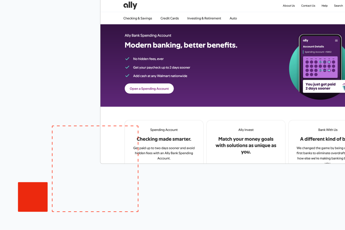
Wise
Wise turned fee transparency into its primary differentiator. The real exchange rate calculator is the first thing you see. No signup required to get a real number.
The visual design is clean but not cold. The copy is conversational. The overall effect is a finance company that does not feel like one, which is exactly the positioning Wise has built its growth on.
Key takeaway: If your competitors are hiding their fees, showing yours is a competitive advantage. Transparency is a design decision as much as a marketing one.
Robinhood
Robinhood's redesign in recent years moved away from the gamified aesthetic that drew regulatory and public scrutiny. The current site is more restrained. The product screenshots show real data rather than artificial gains.
It is a useful case study in how design signals intent. The earlier design communicated excitement. The current design communicates seriousness. Whether the product has changed or not, the visual language is now trying to build a different kind of trust.
Key takeaway: Your design communicates your values before your copy does. If there is a gap between what you say and how the site looks, visitors will believe the design.
Mercury
Mercury targets founders and startup finance teams. The site reflects that audience: technically literate, sceptical of marketing language, and focused on whether the product actually works.
The homepage is product-forward. Screenshots of real dashboards. Named features. Specific integrations. No vague promises about "financial freedom."
Mercury is a strong example to look at alongside best banking website design examples from traditional institutions, because the contrast shows how much the audience shapes the design brief.
Key takeaway: Show the product early. Visitors who can see what they are getting converted better than visitors who have to imagine it.
Revolut
Revolut's site manages a difficult brief: a product with dozens of features across personal and business accounts, available in multiple markets, with different regulatory requirements by region.
The solution is modular. The homepage addresses broad audiences. The product pages go deep. The navigation lets visitors self-select quickly. It is not a perfect execution, but the structure is worth studying for anyone managing a complex product with multiple segments.
For teams looking at how to handle product complexity in financial services, the best fintech website design examples break this down across a wider set of sites.
Key takeaway: Complex products need strong information architecture before they need good design. Sort the structure first.
Best practices for implementing these trends
Navigation and information architecture
Organise by customer type or decision stage, not by product feature. A visitor who arrives wanting to open a business account should not have to parse a navigation built around your internal product taxonomy.
Keep the primary CTA in the navigation bar and visible at all scroll depths. In finance, the primary action is usually "open an account," "get a quote," or "talk to an advisor." That action should never require the visitor to scroll to find it.
Trust signals
Place your most credible proof near your conversion points. Regulatory certifications, customer numbers, and independent ratings earn their keep next to the signup form, not in the footer.
Be specific. "Trusted by over 50,000 businesses" is a trust signal. "Trusted by businesses" is not. The number does the work.
Performance and technical considerations
Core Web Vitals remain a ranking and experience factor in 2026. LCP under 2.5 seconds and CLS under 0.1 are the targets. Finance sites that rely on heavy imagery or complex data visualisations need to be deliberate about how those assets load.
The web development trends shaping 2026 are worth reviewing alongside any finance redesign brief, particularly around performance architecture and component-based builds.
Platform choices
Webflow handles the marketing layer of most finance sites well. It is fast, the visual output is clean, and non-technical teams can manage content without developer involvement. Our Webflow development and design capability covers what that looks like for regulated industries specifically.
For teams currently on WordPress and weighing a move, Webflow migration is a manageable process for most finance marketing sites. The performance and maintenance benefits are significant.
For the application layer, where real-time data, authentication flows, and API integrations live, a headless approach gives more flexibility. The marketing site and the product do not need to be built on the same stack.
Accessibility
WCAG 2.1 AA is the baseline. For finance sites operating in the US, ADA compliance carries legal risk that is worth addressing in the design brief, not retrofitting later. Accessible design also performs better on mobile and in low-bandwidth environments, which expands your addressable audience.
How to approach a finance website redesign in 2026
Start with the diagnosis. Run session recordings (Hotjar and Microsoft Clarity are both free at entry level) for four weeks before touching the design. Find where visitors drop off. That is where the problem is. Do not assume the problem is visual until the data tells you it is.
Define one primary audience. Finance sites that try to serve retail customers, SMEs, and enterprise clients on the same homepage serve none of them well. Pick the segment that drives the most revenue. Build the homepage for them. Handle other segments in the navigation.
Fix the information architecture before the visual design. Most underperforming finance sites have a structure problem, not a colour problem. The right hierarchy, the right navigation labels, and the right placement of trust signals will do more for conversion than a new typeface.
Choose your platform based on your actual constraints. Webflow is the right choice for most finance marketing sites. Custom builds are justified when the compliance requirements, integration complexity, or data architecture makes a standard CMS inadequate. Be honest about which category you are in before scoping the project.
Measure the right things. Bounce rate and time on page are indicators, not outcomes. The metrics worth tracking are quote starts, account opens, and demo requests. Define your conversion events before the build starts so you have a baseline to measure against.
Common mistakes finance teams make in redesigns
Treating compliance copy as a design problem. Regulatory disclosures are real. The question is whether they are treated as boilerplate or as trust-building content. Plain-language compliance copy reads better and converts better than legal text in 8pt grey type.
Designing for the board, not the user. Finance redesigns often go through multiple internal stakeholders who are not the target audience. The result is a site that impresses internally and confuses externally. User testing with real prospective customers is not optional.
Adding features instead of removing friction. A chatbot does not fix a confusing onboarding flow. An AI recommendation engine does not fix unclear pricing. The instinct to add is almost always wrong. The question is what to remove.
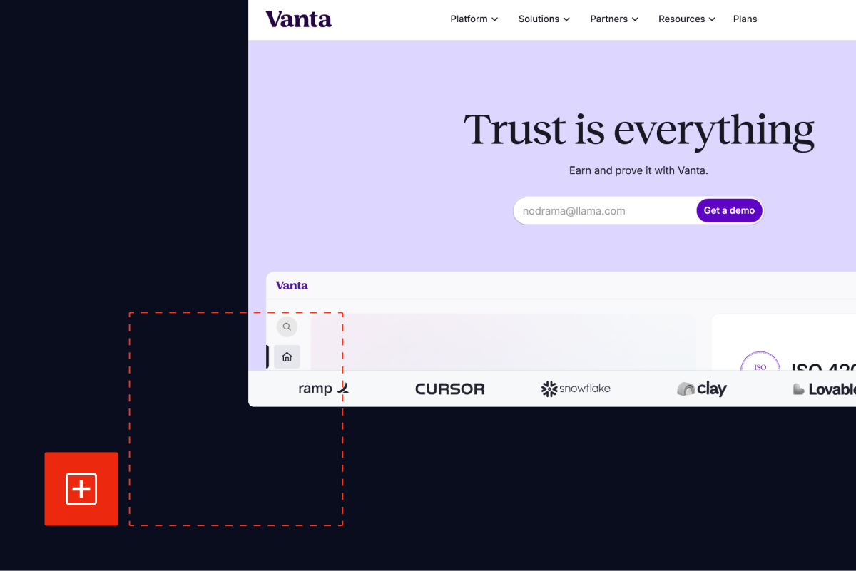
If you want to see how these principles apply across related sectors, the best cybersecurity website design examples show how high-trust, technical audiences respond to similar design decisions.
What the next phase looks like
The sites that will be ahead in 2027 and beyond are the ones building trust through consistency, not campaigns. Every touchpoint, the marketing site, the onboarding flow, the support experience, the product dashboard, needs to feel like it came from the same company with the same values.
That is not a design problem. It is a systems problem. The companies investing in design systems, shared component libraries, and consistent content standards now are the ones that will close the gap.
If you want to see what that looks like in practice, our work includes finance and fintech builds where that systems thinking shaped the brief from the start.
The sites that are failing are not failing because they chose the wrong gradient. They are failing because the brief was wrong. The audience was not defined. The friction points were not diagnosed. The trust signals were placed where they looked good rather than where they worked.
Fix the brief. The design follows from that.
FAQs
What are the top finance website design trends for 2026? Transparency-first information architecture, visible security signals, humanisation through real imagery and founder stories, interactive data visualisation, and mobile-first design across the full decision journey.
How is AI changing finance website UX? Personalisation is becoming more visible and user-controlled. The shift is away from invisible adaptation toward personalisation that users can see, adjust, and trust.
What makes Stripe or Wise's website design effective? Both sites organise around the visitor's goal rather than the company's product structure. Stripe matches content depth to the decision stage. Wise puts fee transparency at the front of the experience rather than hiding it behind a signup.
How can finance sites balance innovation with compliance? Treat compliance requirements as content opportunities, not constraints. Plain-language regulatory disclosures and specific certification claims build more trust than generic security badges.
What metrics should I track for finance website performance? Quote starts, account open rates, and demo requests are the outcome metrics. Bounce rate and session duration are indicators. Define your conversion events before the build so you have a real baseline.
Should traditional banks adopt fintech-style design? Only where it fits the audience. Conservative design signals stability to certain customer segments. The question is not "should we look like a fintech?" It is "what does our specific audience need to see before they trust us?"
Disclaimer: A note on sources
Website examples and trend observations in this article are based on site reviews conducted in June 2026. Design, features, and UX patterns change frequently. Check each company's live site before drawing conclusions for your own build.
Platform recommendations (Webflow, Figma, headless CMS) reflect general use cases as of mid-2026. Verify pricing and feature availability directly with each vendor.
Core Web Vitals thresholds (LCP under 2.5 seconds, CLS under 0.1) are sourced from Google's published benchmarks at web.dev/vitals.