Corporate Website Design Guide 2026: Best Practices & Checklist

Let's Build Your Webflow Website!
Partner with experts who understand your vision. Let’s create a converting user experience and build your website for future growth.
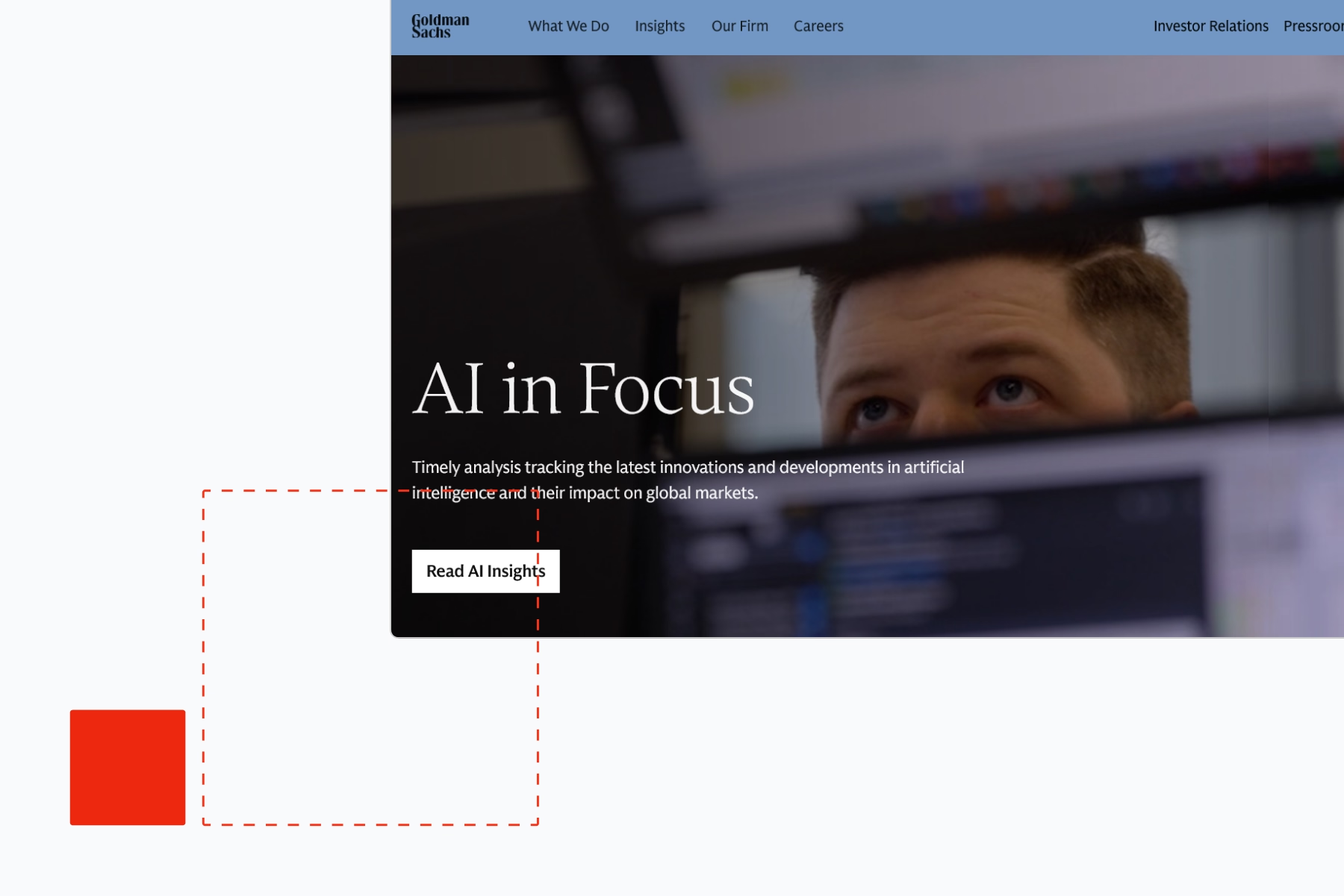
Most corporate websites are the product of too many stakeholders and not enough decisions. Legal wants disclosures. Brand wants consistency. Investor relations wants a dedicated section. Every business unit wants to be visible in the navigation. The result is a site that tries to serve everyone and converts nobody.
The organisations with genuinely effective corporate websites have done one thing differently: they treated the website as a strategic asset with a defined job, not as a communications platform for every team that wanted a voice.
This guide covers how to design that website -the information architecture, the conversion strategy, the platform choice, and the stakeholder alignment process that makes it survivable.
What Makes Corporate Website Design Different from Other Web Design
Corporate website design has a complexity that most web design frameworks don't account for. The audience is multiple and often competing: potential customers, existing customers, investors, job candidates, partners, journalists, and regulators may all arrive at the same homepage with entirely different needs.
The information architecture has to serve all of them. The conversion path has to prioritise the audience that drives the most business value. The content has to represent the whole organisation without requiring a developer ticket every time a business unit updates its product description.
And all of that has to survive a review process involving legal, brand, investor relations, and at least one executive who last thought about the website when they approved the previous redesign three years ago.
67% of the B2B buyer journey is completed digitally before a prospect speaks to sales. The corporate website is where that journey happens. The design decisions made on that site -the information architecture, the conversion path, the trust signals -have direct pipeline implications.
Core Principles of Corporate Website Design
Clarity and Visual Hierarchy
The most common failure on corporate homepages is the absence of a hierarchy. Five value propositions compete for attention. Three CTAs appear in the hero. The eye doesn't know where to go.
Visual hierarchy in corporate web design means making the primary message unmistakable. One headline. One supporting line. One primary CTA. Everything below the fold supports the decision the first screen is trying to drive.
This is not a design preference. It's a conversion principle. Homepages with a single primary CTA convert at measurably higher rates than those presenting multiple equivalent actions.
Trust Signals and Social Proof
B2B buyers making high-stakes decisions research organisations before engaging. The trust signals that accelerate that research:
- Client logos. Recognisable client names reduce perceived risk faster than any marketing copy.
- Specific case studies. Not "we helped a financial services company improve efficiency" -"we reduced Barclays' onboarding time by 40% in six months." Specificity is credibility.
- Third-party recognition. Gartner quadrant placement, industry awards, analyst endorsements -these carry weight with B2B buyers precisely because they're not self-issued.
- Leadership profiles. Buyers often research the leadership team before agreeing to a call. Profiles that communicate experience and credibility, not just titles, do real conversion work.
Consistency Through Design Systems
A corporate website without a design system degrades. Within 12 months of launch, marketing has created multiple variants of the hero component, legal has required a custom page format, and investor relations has requested a layout that doesn't exist in the template library.
A design system -a library of approved components, typography rules, colour usage, and spacing standards -solves this by making the right choice the easy choice. Editors and developers build from a constrained, consistent library. Visual coherence is maintained by the system, not by everyone remembering the brand guidelines.
Information Architecture for Multi-Stakeholder Organisations
Structuring Navigation for Multiple Business Units
Corporate navigation architecture fails in predictable ways. The most common: navigation structured to reflect the company's internal organisation rather than the visitor's questions.
A visitor arriving from a paid search ad for a specific software product doesn't need to know about the company's professional services division. The visitor arriving from a LinkedIn ad targeting CFOs doesn't need the full product suite in their navigation experience.
The navigation that works for complex corporate sites uses audience-based or task-based top-level structure:
- Solutions or use cases (what problem does the visitor have?) rather than products (what does we sell?)
- Audience segments (enterprise, mid-market, specific industries) as navigation pathways
- A mega menu organised by visitor task, not by company org chart
Global search is underinvested on most corporate sites. A well-configured search function is the navigation safety net for everything the primary menu doesn't surface cleanly.
Aligning Legal, Brand, IR and Marketing Stakeholders
The stakeholder alignment problem is the real project management risk on corporate website redesigns. It's rarely discussed in design guides, but it's the most common reason corporate website projects run over time and budget.
The practical framework for managing it:
Define who has final approval authority before the project starts. Not sign-off authority -final approval. One person. The accountability ambiguity that creates three rounds of revision on a hero headline is almost always traced back to an unclear approval structure.
Treat each stakeholder's requirements as constraints, not inputs. Legal's disclosure requirements are constraints: they must be met. Legal's preference for where the disclosure sits on the page is an input: it can be discussed. The distinction prevents requirements from expanding into design direction.
Build stakeholder alignment into the IA phase, not the design phase. Content structure decisions are much easier to change before visual design begins. Stakeholder disagreements about navigation priorities are much less expensive to resolve on a whiteboard than on a completed design.
The Ideal Corporate Homepage Structure
Effective structure follows the logic of a well-prepared sales conversation:
- State the value proposition immediately. Who you help, what you help them do, and why it matters. One headline, one supporting statement.
- Show proof. Client logos, a specific case study headline, or a key metric. Establish credibility before asking for anything.
- Outline services or solutions. Enough specificity that the visitor can confirm they're in the right place without requiring a full navigation exploration.
- Explain the process or approach. How you work, what the engagement looks like, what makes it distinctive.
- Address common objections. The questions that stop buyers from taking the next step -answered directly and specifically.
- One clear primary CTA. Not three CTAs in different colours. One action, consistently repeated.
Content Strategy: Answering the Buyer's Real Questions
Corporate content strategy that doesn't work: content that describes the organisation's capabilities from the organisation's perspective. "We offer a comprehensive range of solutions across multiple verticals."
Corporate content strategy that works: content that answers the questions buyers actually ask at each stage of their decision process.
Stage 1 (awareness): "Is this problem worth solving, and is there a better way?" -thought leadership, market analysis, benchmark data.
Stage 2 (consideration): "Which type of solution fits our situation?" -comparison content, use case explanations, methodology descriptions.
Stage 3 (decision): "Should we trust this organisation with this problem?" -case studies with specific outcomes, client references, pricing transparency, team credentials.
Most corporate websites invest heavily in awareness content and almost nothing in decision-stage content. The case study pages, the pricing transparency, the specific outcome data -these are what convert bottom-of-funnel visitors. They're also the hardest to get approved internally, which is why they're usually absent.
Conversion Optimisation and CTAs
Benchmarks: Average vs Top-Performing Conversion Rates
B2B conversion benchmarks sourced from Vezert's corporate website design analysis. Verify against your own analytics before setting targets.
The gap between 2.1% and 5-10% is not explained by design quality. It's explained by conversion architecture: one clear CTA, specific social proof near the CTA, and a conversion path matched to the buyer's actual decision stage.
CTA principles for corporate sites:
- One primary CTA per page section -not three competing options
- CTA language that describes the next step specifically ("Book a 30-minute strategy call") rather than generically ("Contact us")
- Social proof immediately adjacent to the primary CTA -a client logo, a specific case study outcome, a review
- Consistent CTA placement across all pages so returning visitors don't have to look for the action
Technical Foundations: Performance, SEO and Structured Data
Core Web Vitals are a Google ranking factor and a user experience signal simultaneously. Corporate websites with slow LCP (Largest Contentful Paint) scores are both ranking lower in search and frustrating the senior buyers who arrive from paid campaigns and LinkedIn.
Performance targets for corporate sites:
- LCP under 2.5 seconds on mobile
- CLS (Cumulative Layout Shift) under 0.1
- INP (Interaction to Next Paint) under 200 milliseconds
Structured data for corporate websites:
- Organisation schema. Name, logo, contact information, social profiles -the foundational schema for any corporate site.
- BreadcrumbList. Improves navigation in search results and signals content hierarchy to Google.
- FAQPage. FAQ sections with schema markup are eligible for rich results that expand directly in search.
- Article schema. For thought leadership and blog content, Article schema with author attribution supports E-E-A-T signals.
Accessibility and Compliance (WCAG 2.2)
WCAG 2.2 AA compliance is a legal requirement in the EU, UK, and US federal procurement contexts, and is increasingly written into enterprise procurement requirements in the private sector. For corporate organisations appearing in public procurement or enterprise sales cycles, accessibility compliance is not a best practice -it's a prerequisite.
The WCAG requirements most commonly violated on corporate sites:
- Insufficient colour contrast on body text and UI components
- Interactive elements (dropdown menus, modal windows, form fields) not keyboard-navigable
- Form labels absent or programmatically disconnected from their inputs
- Video content without accurate captions
- PDF documents linked from the site that fail accessibility requirements independently
Choosing the Right Platform: Webflow vs WordPress vs Headless CMS
Platform choice for a corporate website intersects with three practical questions: how much engineering resource is available, how much editorial independence does the marketing team need, and how complex is the content model.
Webflow suits corporate marketing teams that need design fidelity and editorial independence without significant ongoing developer involvement. The visual CMS, the component system, and the performance characteristics make it a strong choice for B2B organisations building marketing sites with CRM integration requirements. Webflow development and design covers what enterprise Webflow builds look like in practice. For organisations considering migration from a legacy CMS, Webflow migration covers the process.
WordPress suits corporate organisations with existing WordPress expertise, a need for WooCommerce or specific plugin functionality, and a development team comfortable with ongoing maintenance. The editorial experience is strong and the platform's maturity means most integration requirements have pre-built solutions.
Headless CMS (Contentful, Sanity, Storyblok) suits organisations with complex, multi-channel content delivery requirements and in-house engineering teams. The build cost is higher and the editorial experience requires more configuration, but the content architecture scales better for organisations managing multiple brands, regions, or channels.
For most mid-market corporate organisations, Webflow provides the right balance of design quality, editorial independence, and total cost of ownership. The enterprise website design guide covers the strategic layer above platform selection for larger organisations.
Planning a Corporate Website Redesign: Timeline and Budget
Typical stakeholder sign-off requirements:
Timeline for a mid-market corporate redesign:
- Discovery and strategy: 3-4 weeks
- Information architecture: 2-3 weeks
- Visual design: 4-6 weeks
- Development and CMS build: 6-8 weeks
- Content migration and stakeholder review: 3-4 weeks
- QA, accessibility audit, and launch: 2-3 weeks
- Total: 20-28 weeks
Budget ranges:
- Mid-market corporate (50-500 employees): $25,000-$80,000
- Large enterprise with complex IA and integrations: $80,000-$250,000+
Timeline typically extends when stakeholder alignment takes longer than planned. Build review cycles into the project schedule explicitly rather than treating them as padding.
Common Corporate Website Design Mistakes
Designing for internal audiences. The navigation structure, the service descriptions, and the homepage hierarchy are often written for employees and executives rather than for the buyers who actually arrive. The test: can someone who has never heard of your company understand what you do and for whom within 10 seconds on the homepage?
Over-investing in visual production and under-investing in content. A beautifully designed site with generic content converts poorly. The specific case study, the pricing indicator, the named outcome -these are what close bottom-of-funnel visitors. They take longer to produce than hero photography but generate more pipeline.
Navigation that requires knowing where to look. If finding your primary service requires knowing which dropdown it lives under, the navigation is failing. Test with first-time visitors before launch.
Multiple competing CTAs. Offering visitors "Request a demo," "Contact sales," "Download a guide," "Start a free trial," and "Book a call" on the same page doesn't give options -it creates paralysis. Commit to one primary conversion goal per page.
Treating the launch as the end of the project. A corporate website launched and left degrades. Core Web Vitals fall as third-party scripts accumulate. Content becomes outdated. Conversion rates drift down without measurement. Build a quarterly review cycle into the ownership model from day one.
Corporate Website Design Checklist
Strategy and stakeholder alignment
- [ ] Defined primary conversion goal with a measurable metric
- [ ] Single accountable decision-maker identified before design begins
- [ ] Legal, brand, IR, and business unit requirements documented as constraints
- [ ] Visitor audience priority order agreed (who does the site primarily serve?)
Information architecture
- [ ] Navigation organised by visitor task or audience segment, not internal org structure
- [ ] Maximum 7 top-level navigation items
- [ ] Site search configured and indexed correctly
- [ ] Every page has a defined next step -no dead ends
Homepage and conversion
- [ ] Value proposition visible above the fold on mobile
- [ ] Client logos or specific social proof on the homepage
- [ ] One primary CTA, consistently placed across all pages
- [ ] Case studies with specific, named outcomes linked from the homepage
Technical
- [ ] Core Web Vitals in the "good" range on mobile
- [ ] Organisation schema and relevant structured data implemented
- [ ] WCAG 2.2 AA compliance verified through automated and manual testing
- [ ] SSL/HTTPS on every page
- [ ] 301 redirects in place for any changed URLs
Content
- [ ] Every headline answers "what do you do and for whom"
- [ ] Generic marketing phrases removed or replaced with specifics
- [ ] All case studies include named client, specific problem, and measurable outcome
- [ ] Author attribution on thought leadership content
Work with Shadow Digital
Corporate website redesigns that fail do so for a predictable reason: the site was built to satisfy stakeholders rather than to convert buyers. Shadow Digital helps B2B organisations build corporate websites that do the actual job -generating qualified pipeline.
Book a strategy call to talk through your redesign requirements and stakeholder situation. Or see our work to understand how we approach corporate website builds.
A Note on Sources
B2B conversion benchmarks (2.1% average conversion rate, 5-10% top decile, 67% of B2B buyer journey completed digitally) are sourced from Vezert's corporate website design analysis. Typical project cost and timeline estimates ($25,000-$80,000, 8-14 weeks) are industry benchmarks and will vary significantly by scope and organisational complexity. Verify all figures against current sources and your own analytics before using as targets.
Frequently Asked Questions
What Is the Difference Between Corporate Website Design and Regular Web Design?
Corporate website design has to account for multiple internal stakeholders (legal, brand, investor relations, business units), a more complex information architecture serving multiple audience types, and a higher bar for credibility and trust signals than a typical marketing site.
What Is a Good Conversion Rate for a Corporate Website?
The average B2B website converts at around 2.1%, while the top 10% of performers achieve 5% to 10% -useful benchmarks for setting realistic goals for a redesign.
How Long Does a Corporate Website Redesign Take?
Typical mid-market B2B corporate website projects take 20-28 weeks from discovery to launch. Scope, stakeholder complexity, and content volume can extend this significantly. The timeline is more often driven by internal review cycles than by design or development work.
Should a Corporate Website Use Webflow, WordPress, or a Headless CMS?
Webflow suits most mid-market corporate organisations: strong design control, editorial independence for marketing teams, and lower total cost of ownership than a custom headless build. WordPress suits organisations with existing expertise and specific plugin requirements. A headless CMS suits large organisations with complex multi-channel content needs and in-house engineering support.
What Should Be on a Corporate Website Homepage?
An effective structure states the value proposition immediately, follows with proof and credibility (client logos, specific case study outcomes, certifications), outlines services or solutions, explains the process or approach, addresses common objections, and ends with one clear call to action.
How Often Should a Corporate Website Be Redesigned?
A full redesign every 3-4 years is typical, but continuous improvement -monitoring Core Web Vitals, running conversion tests, and refreshing content - is more effective than waiting for a full rebuild. Build a quarterly review cycle into the ownership model from launch.