15 Best Corporate Website Design Examples in 2026 (and What to Learn from Each)

Let's Build Your Webflow Website!
Partner with experts who understand your vision. Let’s create a converting user experience and build your website for future growth.
Good corporate website design is not about visual style. It's about structural discipline: the right information in the right order, trust signals in the right places, and one conversion path that never gets ambiguous.
The 15 examples below are chosen because they demonstrate that discipline -across different industries, different company sizes, and different buyer audiences. Each is broken down by what it does well structurally, not aesthetically, because the structure is what you can actually replicate.
For the strategic framework behind these examples, see the companion corporate website design guide.
What Makes a Corporate Website Example Worth Studying
Before the examples, the analytical framework. Apply these five dimensions to every site below -and to your own before a redesign.
Financial and Professional Services Examples
1. Goldman Sachs -goldmansachs.com
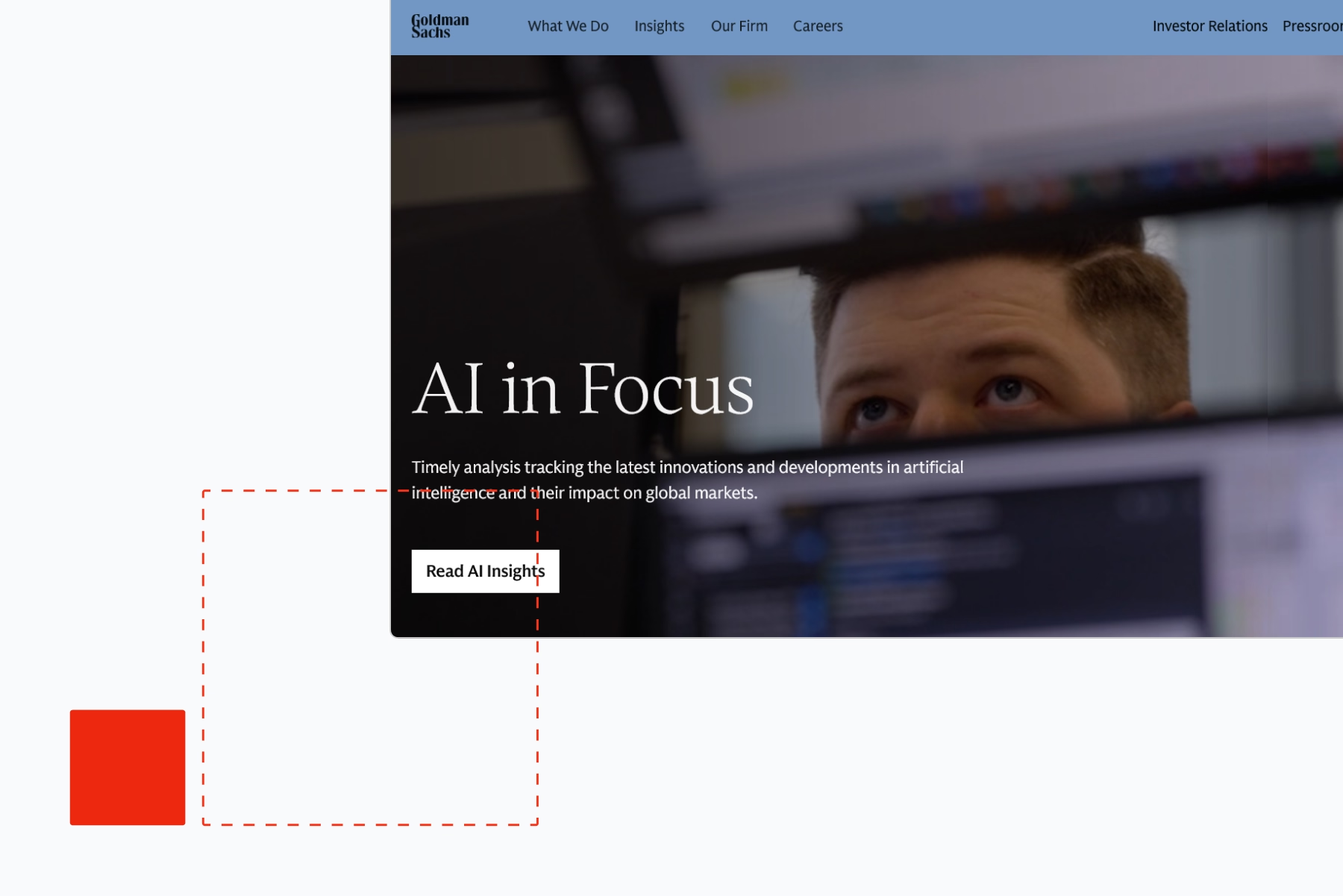
Goldman Sachs' institutional site is one of the better examples of a major financial institution communicating authority without relying on financial services design clichés. The visual language is restrained and typographically confident. There are no stock photos of people shaking hands.
What to learn: The hierarchy between the public-facing business content and the institutional investor sections is cleanly managed -two genuinely different audiences coexist without one diluting the other. The navigation doesn't try to merge them into a single experience. This is audience segmentation done structurally rather than as a UX afterthought.
Conversion path: The Goldman site is not optimised for inbound lead generation -it's a credibility and research destination for audiences who already know who Goldman Sachs is. The absence of aggressive CTAs is intentional and appropriate for the audience.
2. UBS -ubs.com
UBS manages a genuinely complex product and service portfolio across wealth management, investment banking, and retail banking in multiple countries. The top-level navigation is audience-segmented -individuals, institutional clients, corporates -rather than product-segmented. This means a CFO arrives at a different experience from a private client without both feeling like they're in someone else's section of the site.
What to learn: The audience-first navigation model. Most corporate sites with multiple customer segments default to a single navigation that tries to serve everyone simultaneously. UBS's approach gives each segment a clear entry point and a distinct experience without requiring separate domains or sub-sites.
3. Deloitte -deloitte.com
Deloitte's website carries an enormous content burden: a global professional services firm with dozens of service lines, hundreds of industry practices, and thousands of pieces of thought leadership content. The site manages this through a search-first model -the navigation surfaces the major categories, but the expectation is that users with specific needs will search.
What to learn: The thought leadership integration. Industry reports, economic outlooks, and research publications are woven into the service and industry pages rather than siloed in a separate "insights" section. The content does the trust-building work on the same pages that are asking for the conversion.
Consulting and B2B Services Examples
4. McKinsey and Company -mckinsey.com
McKinsey's website is a content operation as much as a marketing site. The depth of published research, case studies, and executive perspectives creates a trust environment that no amount of brand photography could replicate.
What to learn: The article-within-a-service-page model. McKinsey integrates relevant published content directly into service and capability pages -so a visitor researching their supply chain consulting practice encounters specific, credible research alongside the service description. The content is the proof, not a separate "resources" section the visitor has to navigate to.
Performance note: McKinsey's site loads slower than it should given the content depth. This is a common pattern for content-rich corporate sites -the technical performance debt accumulates as content volume grows without corresponding engineering attention.
5. KPMG -kpmg.com
KPMG's site handles a recurring challenge in professional services: all the Big Four firms offer roughly equivalent services to roughly equivalent clients. Differentiation has to happen through content and specificity, not product features.
What to learn: KPMG's industry-specific microsites within the main domain are genuinely more specific than most professional services content. The financial services section, for example, contains content written for the specific regulatory and operational concerns of financial services buyers -not generic consulting content repurposed for the sector.
6. Accenture -accenture.com
Accenture has invested heavily in its website as a content platform and it shows. The visual design is more distinctive than most consulting firms. The use of bold typography and specific imagery (real projects, real teams) creates a different visual register from the stock-photography standard of the industry.
What to learn: The "case study as a visual anchor" model. Accenture surfaces specific client outcomes prominently on its capability pages -not just in a separate case studies section. "We helped a major retailer reduce supply chain costs by 23%" near the supply chain consulting description does conversion work that a generic service description can't.
SaaS and Technology Examples
7. Salesforce -salesforce.com
Salesforce manages one of the most complex corporate website problems: a very large product suite, a very large customer base, and multiple distinct buyer audiences (sales leaders, marketing leaders, service leaders, technical developers). The homepage doesn't try to address all of them simultaneously -it leads with a value proposition that works across segments and uses navigation to route visitors appropriately.
What to learn: The demo CTA architecture. Salesforce's primary conversion path is "watch a demo" rather than "contact sales" -a lower-commitment action that generates qualified pipeline without requiring a prospect to declare intent to buy. For corporate sites selling complex products with long sales cycles, a demo or trial CTA typically outperforms a direct sales CTA at the top of the funnel.
8. HubSpot -hubspot.com
HubSpot's website is studied in B2B marketing circles for a reason. The navigation is audience-segmented by role (marketing, sales, service, operations), not by product. The free-tier CTA strategy brings visitors into the product before asking for money. The blog generates substantial organic traffic that converts into the main funnel.
What to learn: The role-based navigation structure and the free-tier conversion model. Not every corporate site can offer a free tier, but the principle of segmenting the navigation by what the visitor does rather than what the company sells is applicable to almost any complex B2B corporate site.
9. Stripe -stripe.com
Stripe's website is widely referenced as a benchmark for technical product marketing -a complex API product explained clearly enough for both technical and non-technical decision-makers to understand what it does and why it matters.
What to learn: The simultaneous technical and non-technical communication. Developer documentation and marketing copy exist in the same visual language. A CTO and a CFO can both arrive at Stripe's website and leave understanding the product. Most corporate sites optimise for one audience and lose the other.
Enterprise and Global Brand Examples
10. Siemens -siemens.com
Siemens is a genuinely global enterprise with a product and service portfolio spanning industrial automation, healthcare technology, energy, and transportation infrastructure. The website handles this by segmenting primarily by industry and by geography, rather than attempting a single global product navigation.
What to learn: The geographic and industry personalisation model. Siemens serves different content based on country and industry vertical -a visitor from a German manufacturing company gets a different experience from a visitor from a US hospital system. The implementation requires investment, but the principle -that a global enterprise's website should know something about who's visiting -is increasingly achievable without enterprise-scale engineering.
11. IBM -ibm.com
IBM's website reflects a decade of repositioning: away from hardware toward cloud, AI, and enterprise consulting. The visual design and content architecture have moved significantly from the traditional "big blue" IBM aesthetic toward something more contemporary.
What to learn: The use case-first architecture. IBM's primary navigation is organised around business problems (automate workflows, secure infrastructure, develop applications) rather than product categories. For complex enterprise technology companies, this is the correct navigation philosophy -buyers rarely know which IBM product category they need, but they do know what problem they're trying to solve.
Mid-Market and Growing Business Examples
12. Intercom -intercom.com
Intercom has one of the cleaner corporate sites in the B2B SaaS category. The homepage hierarchy is disciplined: one headline, one supporting statement, one CTA, followed by specific social proof before any product detail.
What to learn: The social proof placement. Intercom puts specific customer outcome metrics directly below the hero -"Fin AI Agent resolves 51% of support volume instantly" is adjacent to the primary CTA, not hidden in a case studies section three pages deep. This is the highest-leverage placement for social proof on a corporate site.
13. Figma -figma.com
Figma's site is notable for demonstrating the product within the design of the site itself. The use of design-system thinking in the visual language, the clear product screenshots in context, and the specificity of the use case descriptions all reflect a company that understands its buyers are evaluating the product before signing up.
What to learn: The product-in-context visual model. Rather than abstract "collaboration" messaging, Figma shows specific screens with specific functionality. For B2B product companies, showing the product in the context of a real workflow is more persuasive than any marketing copy.
14. Calendly -calendly.com
Calendly's homepage does something most corporate sites fail at: it answers the visitor's implicit question within 5 seconds. "What is this? Scheduling automation. Who is it for? Everyone who books meetings. How do I start? Free for individuals."
What to learn: The sub-10-second comprehension model. A visitor should be able to understand what the company does, who it's for, and what to do next within the first viewport. Calendly's homepage achieves this through ruthless simplicity -no visual clutter, no competing messages, no vague value propositions.
15. Notion -notion.so
Notion's website manages a genuinely hard product positioning problem: the product is extremely flexible and is used differently by every team. The homepage doesn't try to describe all use cases -it leads with a broad positioning ("the workspace that adapts to you") and uses the sections below the fold to demonstrate specific use cases for specific team types.
What to learn: The flexible positioning followed by specific segmentation model. If your product or service genuinely serves multiple distinct audiences, don't try to collapse them into a single value proposition. State the broad positioning in the hero, then use the sections below to demonstrate specific value for each segment.
Common Patterns Across the Best Corporate Websites
Looking across all 15 examples, the structural decisions that consistently separate the best sites from the rest:
One clear primary CTA. Every example above has a dominant conversion action -demo, free trial, contact, or subscribe. None present four equivalent options and leave the visitor to choose.
Specific social proof near the conversion point. Client logos, named outcomes, and specific metrics appear close to the CTA in every strong example. Generic testimonials appear nowhere in the top tier.
Navigation that reflects visitor intent, not internal structure. The strongest navigations are audience-first or task-first, not product-first or department-first.
Content as trust signal, not as noise. The organisations with the highest-trust sites (McKinsey, Deloitte, Goldman Sachs) invest in substantive, specific content rather than marketing copy. The content is the credibility.
Performance that doesn't undermine the brand. Sites that load slowly signal technical debt and undermine the authority their content is trying to build. The strong examples load fast -and the ones that don't (McKinsey) lose points for it.
How to Apply These Examples to Your Own Redesign
The most common mistake in using competitor and peer examples during a redesign is visual reference rather than structural reference. Teams collect screenshots, identify visual styles they like, and brief designers on aesthetic direction -without extracting the structural logic that makes those sites actually work.
The more useful approach:
Map the information hierarchy of three examples you admire. What does the hero communicate? What proof follows? What does the navigation surface at the top level? How many CTAs appear above the fold? The answer to those questions is the architecture -and the architecture is what you can actually replicate.
Identify the conversion architecture. What is the primary CTA? Where does it appear? What social proof sits adjacent to it? What is the path from the homepage to the conversion point?
Note what's absent. The best sites are characterised as much by what they don't include as by what they do. The navigation items that don't exist. The value propositions that weren't added. The stock photos that were never used.
Work with Shadow Digital
A corporate website that studies well but doesn't convert is a brand asset, not a revenue asset. Shadow Digital builds corporate sites for B2B organisations that need both -design quality and conversion architecture.
Book a strategy call to talk through your redesign. Or see our work for examples of corporate sites we've built.
A Note on Sources
Website examples reflect live sites at time of writing and may have changed since publication. Performance observations are based on publicly observable site behaviour and available Lighthouse data. Shadow Digital has no commercial relationship with any company mentioned in this article.
Frequently Asked Questions
What Industries Have the Best Corporate Website Examples?
Financial services, consulting, and B2B SaaS tend to produce the most studied corporate website examples because trust, credibility, and a clear buyer journey matter most in those categories -though strong examples exist across every industry.
Do I Need a Fortune 500 Budget to Build a Great Corporate Website?
No. The strongest corporate websites succeed through structural discipline -the right information in the right order, clear trust signals, and a focused conversion path -rather than expensive visual production. That's achievable at almost any budget.
What Should I Look for When Studying a Competitor's Corporate Website?
Focus on structure over aesthetics: how they sequence their homepage, what trust signals they use, how their navigation is organised, and what their primary calls to action are. The visual style is far less important to replicate than the underlying logic.
How Many Pages Should a Corporate Website Have?
The core pages worth prioritising are homepage, about/company, services or solutions, case studies or proof points, and contact. Everything else should support the buyer's decision journey. More pages isn't better - clarity is better.
What's the Difference Between a Corporate Website and a Marketing Landing Page?
A corporate website serves multiple audiences (customers, investors, job candidates, partners) and represents the whole business. A landing page is built around a single, narrow conversion goal for a specific campaign or audience segment.